DERMIS—01
No bright color.
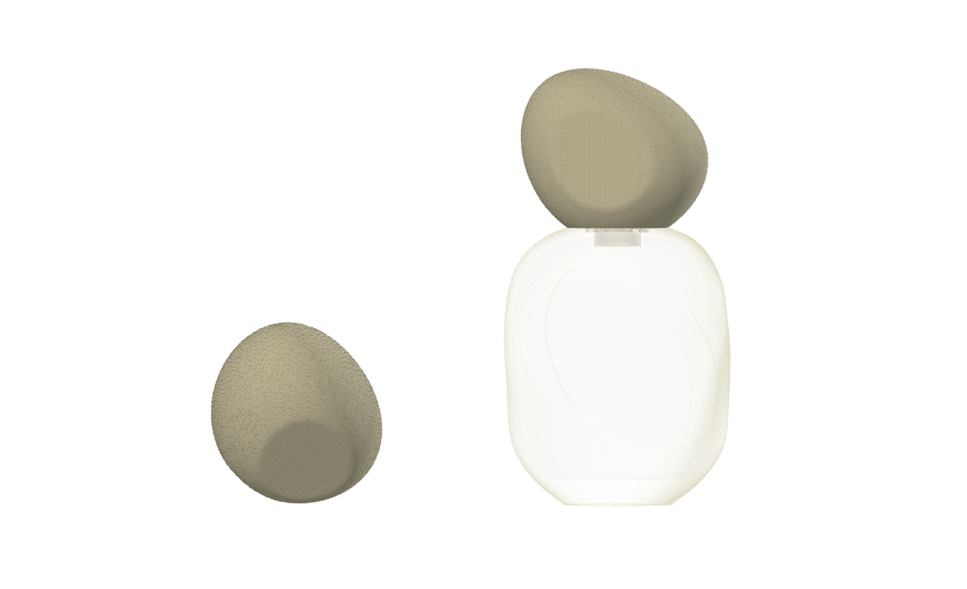
Frosted glass, warm graphite caps and bone-white print. The narrow palette also means fewer print passes and easier color matching across parts.
MOOD//STONE — color study
Ideas from far outside the beauty aisle, tested against five lenses before they reach the factory.
Scroll to see where ideas come fromJarsking Studio, the design studio of Jarsking Packaging, designs from two inputs: inspiration and constraints. Inspiration comes from your taste and from sources far outside the beauty aisle, like a pebble, the tide or Tokyo after midnight. Constraints come from your formula, price, sales channels and sustainability goals. Every idea is tested against both before it reaches the factory.
Act 1 · Inspiration
Before we draw anything, we ask for your taste: three to five references you love, with one line on why, the looks and colors you want to avoid, and up to five words from the list in our brief. What a brand rules out shapes the idea as much as what it wants.
Lines from our own briefs
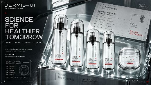
DERMIS—01
Frosted glass, warm graphite caps and bone-white print. The narrow palette also means fewer print passes and easier color matching across parts.
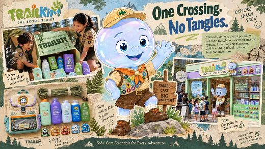
TRAILKIT
Kids’ bath and body care styled as scout field gear, for children too old to be babied.
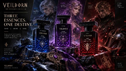
VEILBORN
A dark-fantasy trilogy built as an original world: a knight, a swordsman and a witch, one bottle each.
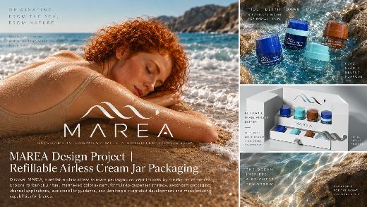
MAREA
A refillable jar family that keeps pace with the tide instead of fighting time.
Filter by feeling uses the same words as our brief.
It is easy to design packaging by looking at other packaging. We look somewhere else first: at nature, the sky, cities, rituals, stories, science and everyday objects. Pick a source to see the bottle it became.
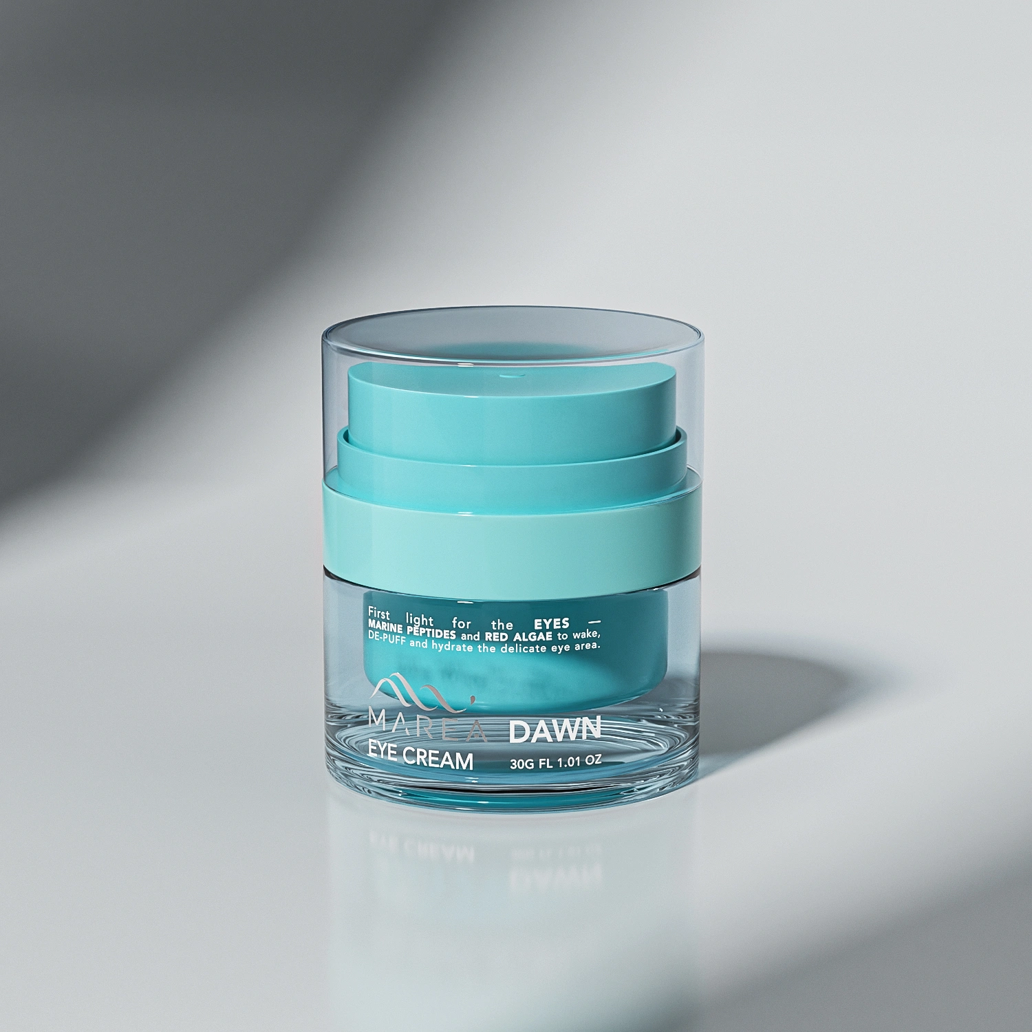
Any concept here can be adopted for your own brand.
See all work
Act 2 · Constraints
A beautiful idea is only half a design. Before anything reaches the factory, we look at it through five lenses, each one fed by a section of your brief.
01 / Formula
The Formula lens matches the pack to what goes in it: texture and viscosity choose the closure, and sensitivity to air, light or alcohol chooses the material and the pump.
02 / Hand
The Hand lens checks how a pack is held, opened and dosed every day, and how it changes when it becomes a gift or a travel size.
03 / Shelf
The Shelf lens sets how premium a pack should read, from mass to luxury, using your retail price and the brands you want to sit beside.
04 / Screen
The Screen lens checks how a pack reads where it is sold online: as a phone post, a flat-lay and a small thumbnail, as well as on a physical shelf.
05 / Afterlife
The Afterlife lens plans what happens after the last use: recycled content, single-material parts that are simpler to recycle, refills, and paper choices.
Formula → pack
Illustrative packaging study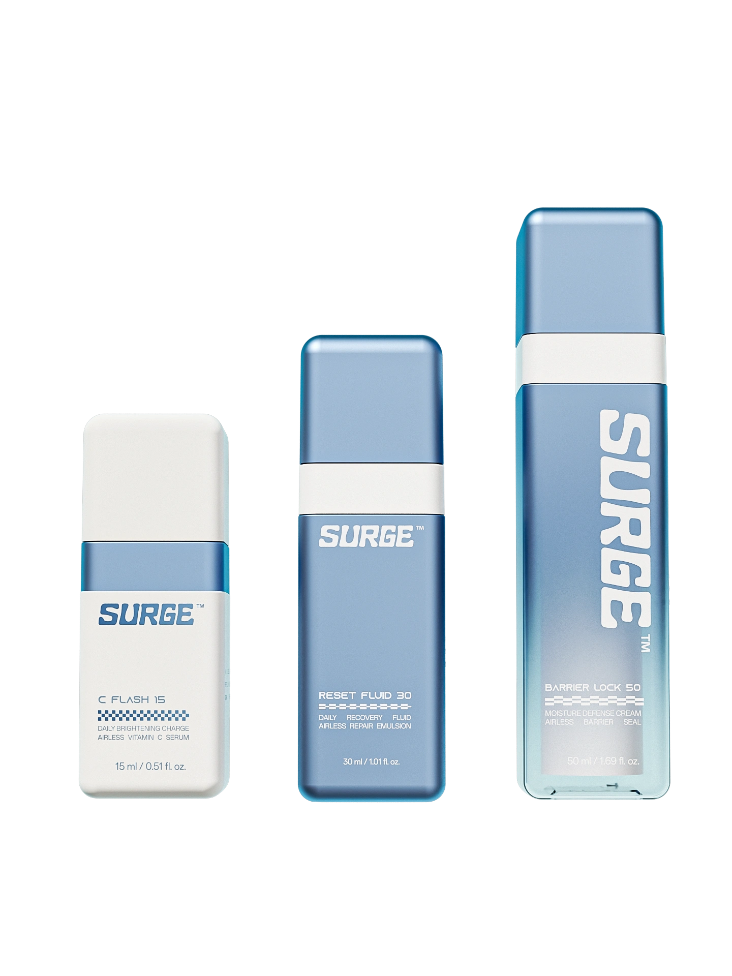
From our work · SURGE™
SURGE™ uses an airless pump to protect active formulas, with a refillable inner cartridge: the bottle stays, the core is replaced.
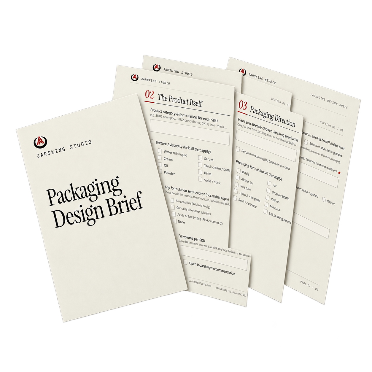
Our Packaging Design Brief asks for your taste and your constraints in eight short sections. You don’t need every answer: where you’re unsure, tick “Open to Jarsking’s recommendation” and we advise. The marked questions are all we need to start your moodboard.
The online brief goes straight to the Studio. Prefer a file? Download the PDF and send it to jarskingstudio@jarsking.com, or attach it to the form below. One of our team replies within 1–3 working days, and the first working session is free.
Eight things: you and the project; the product and its formula; packaging direction; market and positioning; aesthetic direction; brand and story; sales channels; and logistics, including MOQ, unit budget and timeline. Aesthetic direction matters most: the references you love and the looks you want to avoid. Fill in our brief online, or download it as a PDF. Start with the brief
That is normal. Fill in what you know, and leave the rest blank or tick “Open to Jarsking’s recommendation”. We advise in the first working session, which is free.
From your taste first, then from sources far outside the beauty aisle. For fragrance, a pebble became MOOD//STONE and Saturn’s seasons became SATURNINE; for skincare, the tide became MAREA and Tokyo after midnight became KUROE™.
Yes. The Screen lens checks how a pack reads as a phone post, a flat-lay and a thumbnail; the Shelf lens checks how it reads in a store. Your brief tells us which channels matter most.
Yes, when your brief asks for it. Recycled content, single-material parts, refills and paper choices are planned in the Afterlife lens. A material claim goes on a pack only when a certificate or test report supports it.