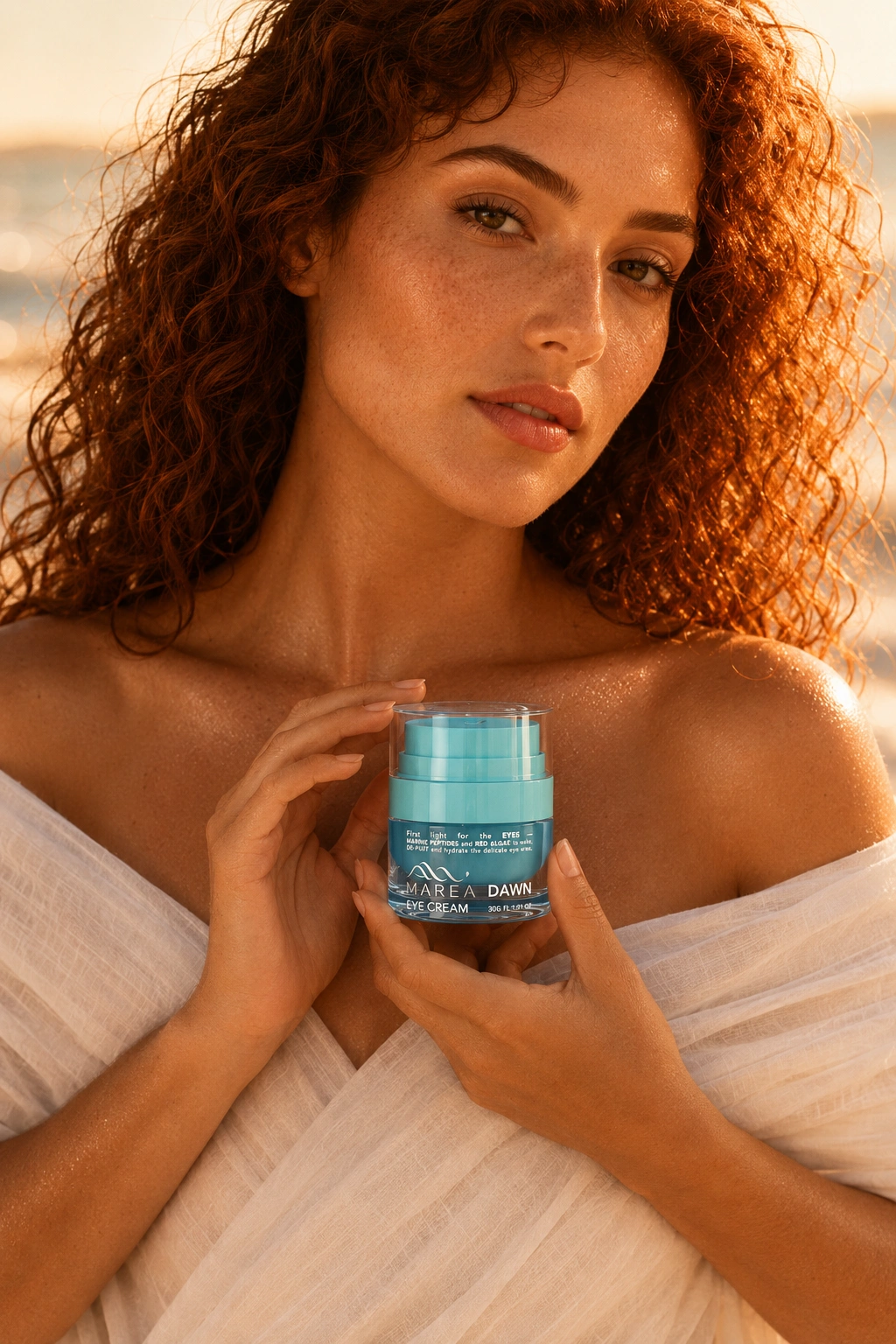
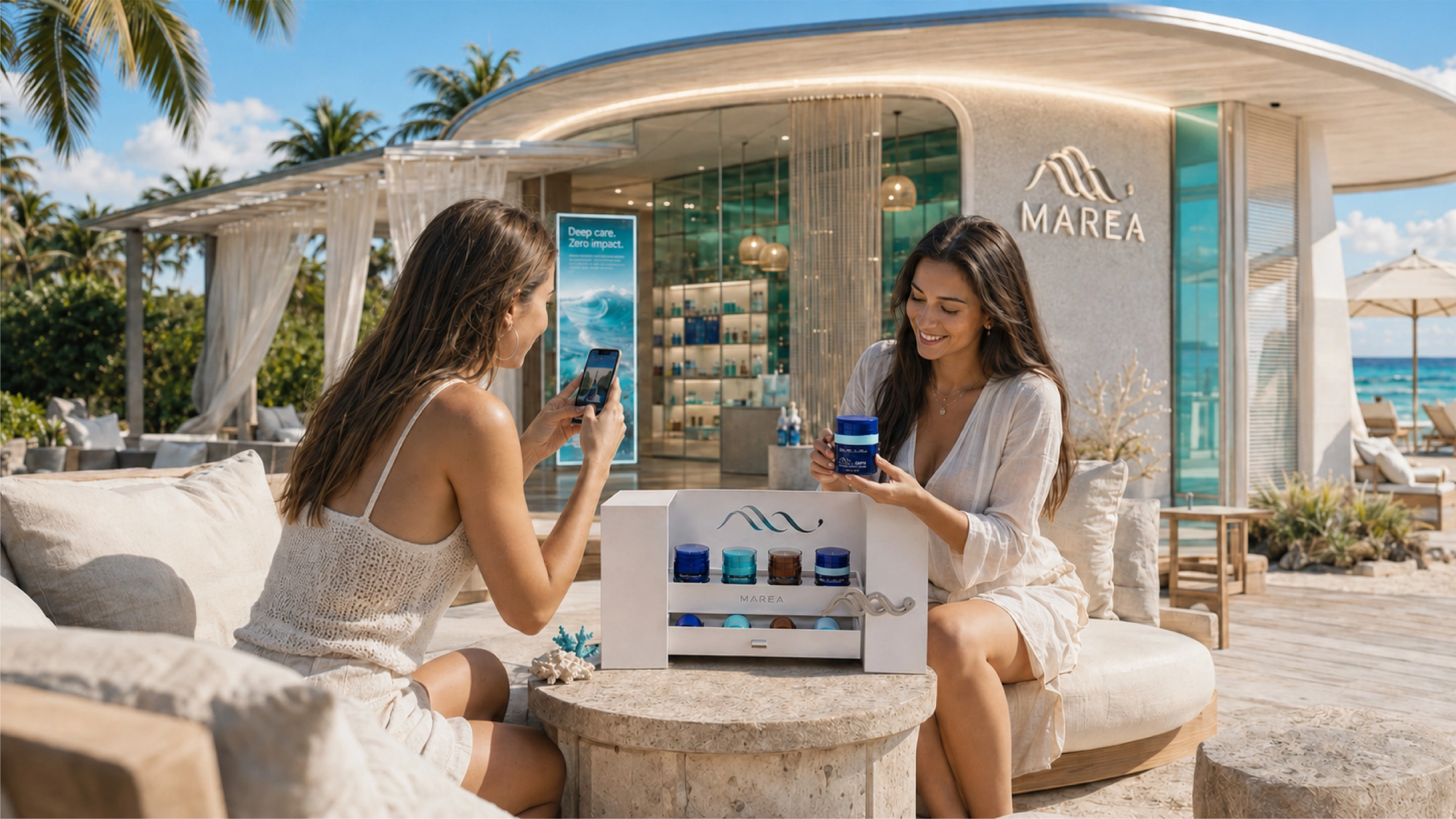
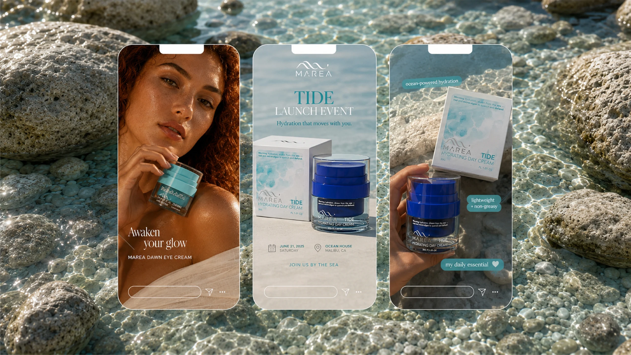
The tide returns to shore, and the idea becomes tangible. MAREA brings clear glass, a colored inner and the returning wave into one visual language. Turning that language into custom skincare packaging means deciding what stays consistent, what changes across the range, and what the physical sample must prove.
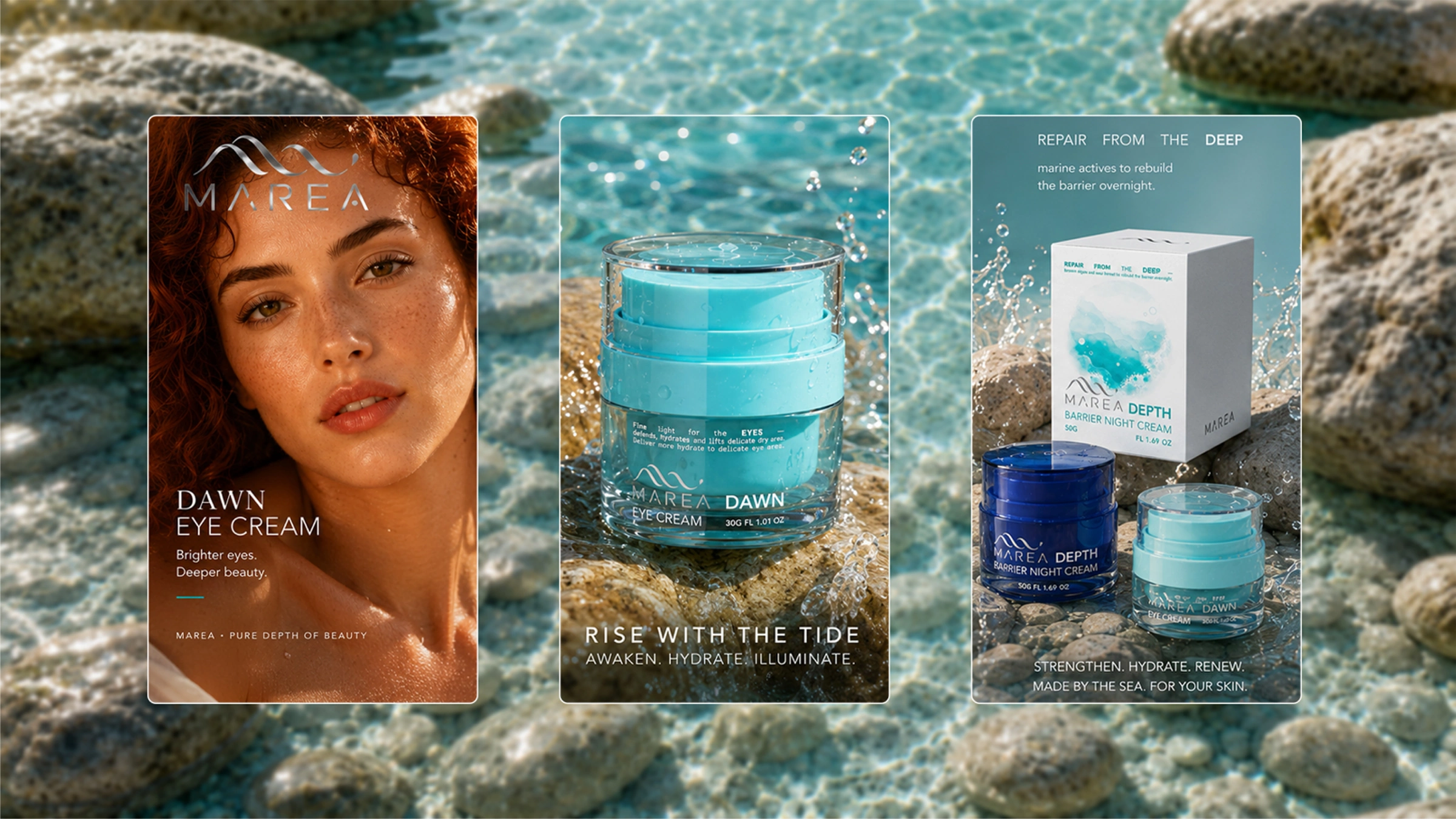
Recognition begins before the label is read. MAREA keeps a clear cylindrical outline around the colored inner, making the refill part of the outward identity. For a glass cream jar design, establish the proportions, closure and refill interface before extending the range. The silhouette becomes a starting rule for the next size, product and refill.
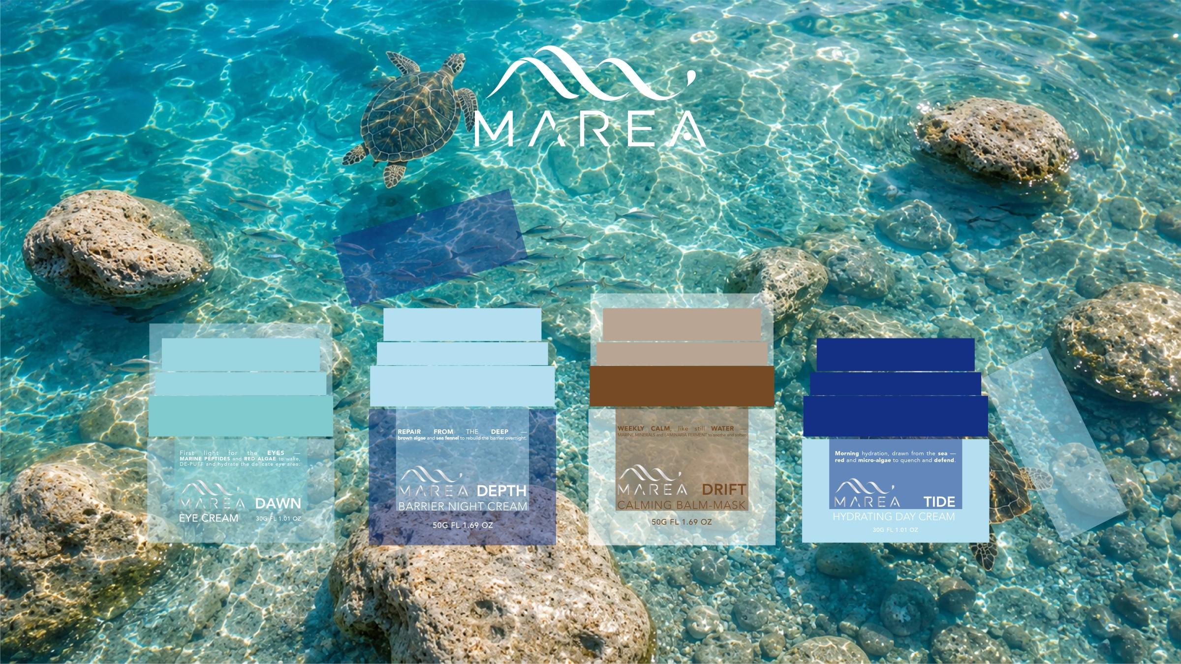
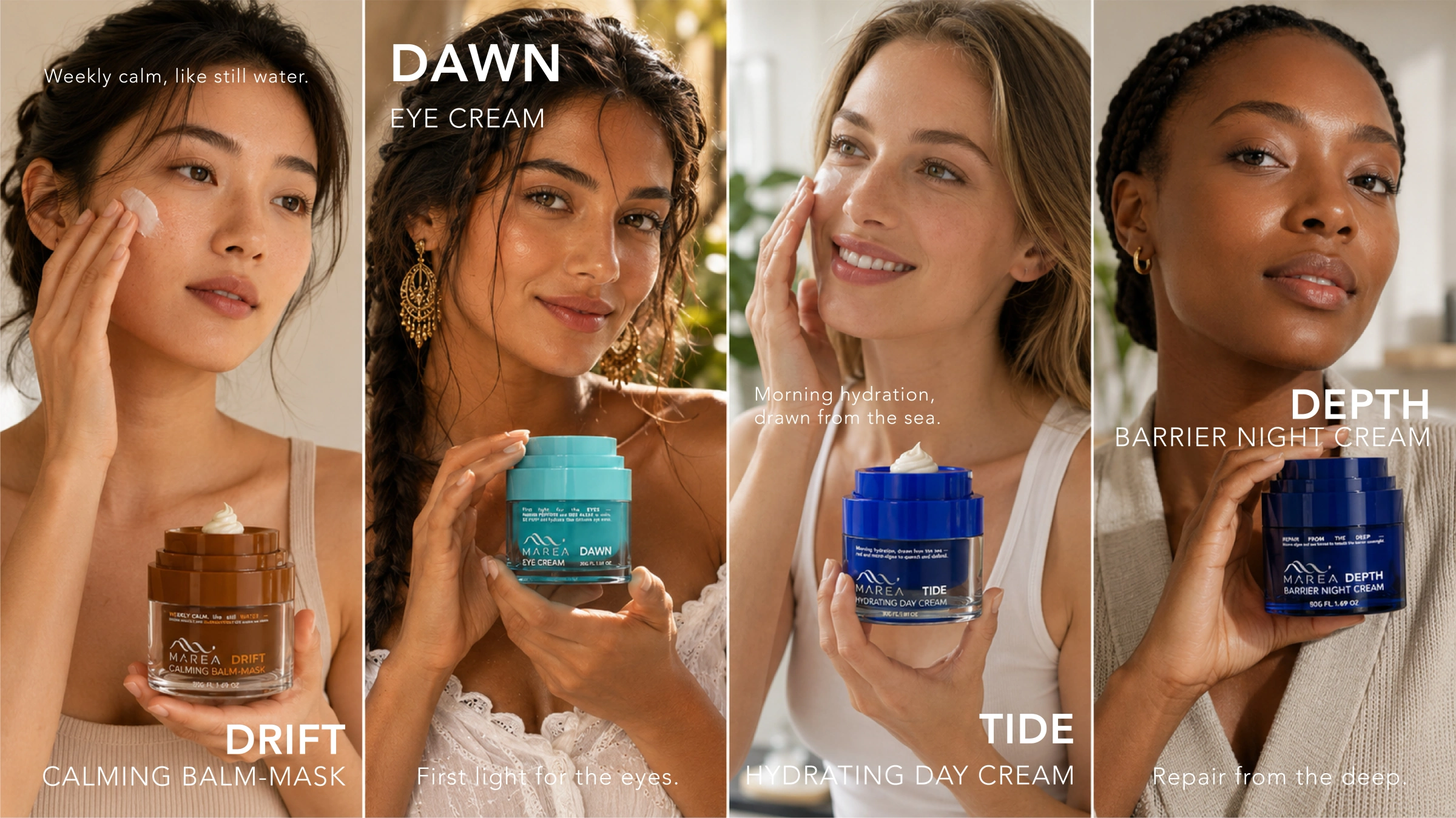
The coast becomes a way to navigate the range. Cobalt anchors TIDE, aqua distinguishes DAWN, and amber gives DRIFT its warmth; DEPTH pairs deep blue with a pale band. Printed names add a second cue. Agree physical color references for each material, so the collection reads as one family across glass, plastic and print.
Carry the design into a sample brief. Decide which details can be achieved through color and decoration, and which need a different component or new tooling. Approve assembled samples against the artwork and agreed physical references. To explore your own range, bring the product category, target fill, estimated quantity and packaging budget.