
Color Is a Relationship,
Not a Swatch
A color changes with its surroundings. Starting with Josef Albers's experiments, we explore how context shapes what we see, and what that means for brand palettes, product families and the passage from a screen to a physical object.
Explore the essay
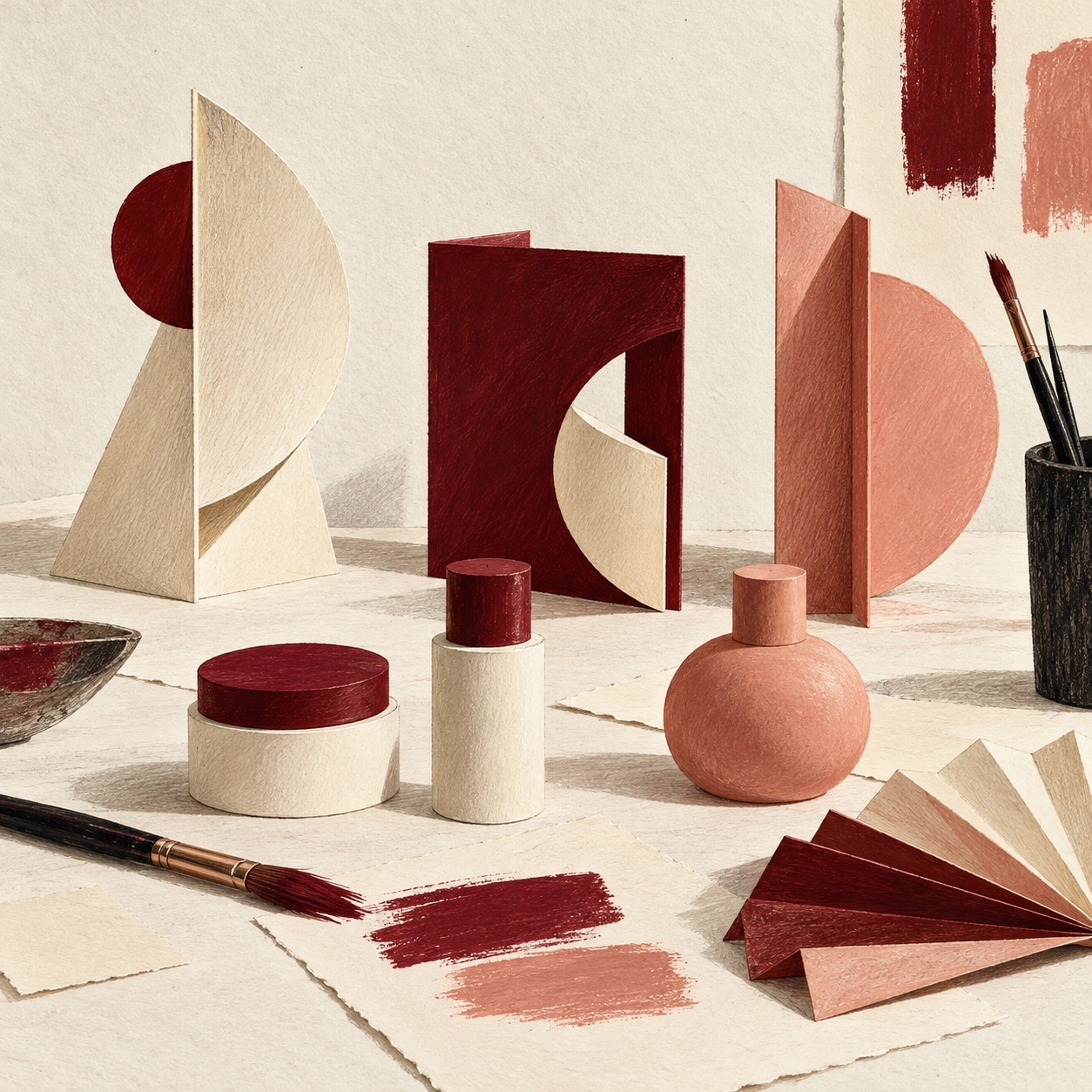
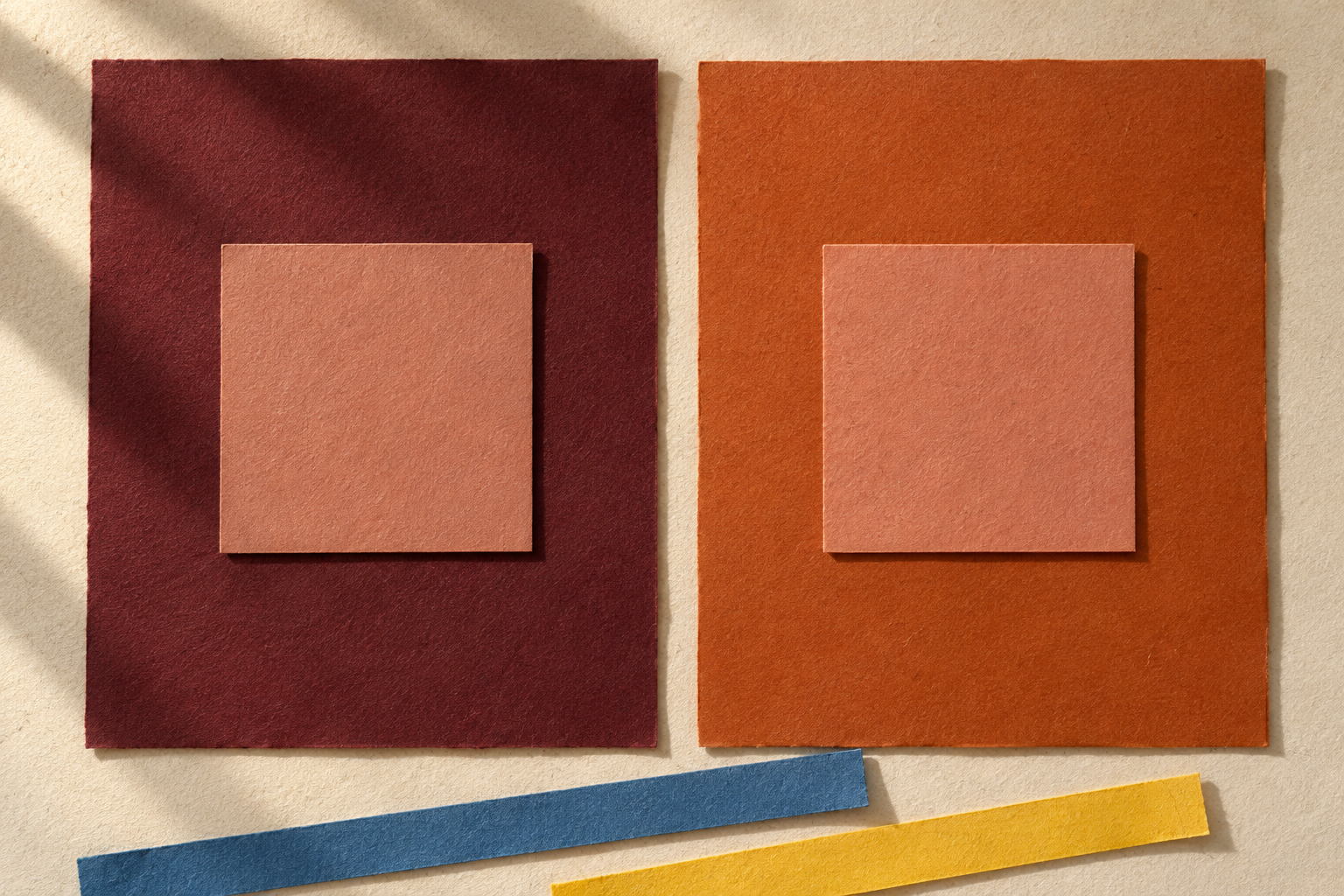

Color in design depends on relationships. The same color can appear different when its surroundings change, even when its digital value stays fixed. For a designer, this makes the space around a color part of the decision: the background, neighboring image, area it occupies and words it needs to carry.
Try the color studyLearn by looking
Albers approached color as something to investigate through experience. His book Interaction of Color, first published by Yale University Press in 1963, gives that investigation a tangible form. Its visual studies invite a reader to make comparisons and revisit an initial impression. See the publisher’s account of the book.
The Josef & Anni Albers Foundation describes a teaching practice centered on developing awareness of what we see. Its archive includes a student color study whose task was to make one color appear like two. The exercise matters because it asks the learner to hold the material constant while changing the visual relationship around it. Explore the Foundation’s teaching record.
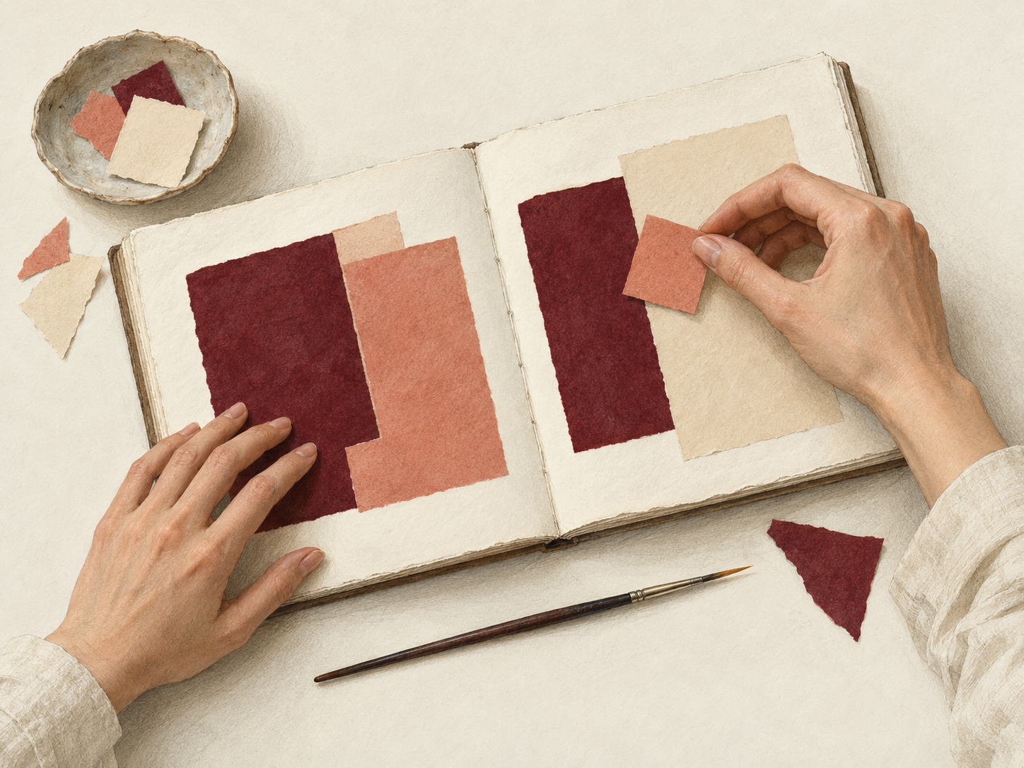
The physical activity is part of the method. In Yale’s conversation with Foundation curator Brenda Danilowitz, the experience of moving between text and color studies emerges as an active process of learning. A reader has to give the relationships time and attention. Read the publisher and curator conversation.
Fritz Horstman’s companion, Interacting with Color, continues this hands-on approach through exercises using simple materials. For a contemporary designer, the useful inheritance is a habit: make a comparison, look carefully, change a condition and look again. See Horstman’s practical guide.
Our application begins there. We propose carrying that habit into brand decisions, so that approving a palette includes seeing it operate. The branding and packaging exercises that follow are our interpretation of the teaching, rather than recommendations attributed to Albers.
Change the balance
A useful palette review includes the amount of each color, because a list of swatches leaves the composition unresolved. A small burgundy mark on a cream field and a large burgundy field carrying cream type contain the same two colors. They make different visual arrangements.
Try a simple study before adding imagery or copy. Make two panels from the same three colors, then change how much space each one occupies. In one, give the light ground most of the area. In the other, let the dark color dominate. Keep the panel size and the color values fixed.
Percentages describe the base color fields. The letterform adds another relationship to judge. These are composition studies, not recommended palette ratios.
The three color values remain unchanged; the field proportions total 100%.
Describe the differences you can actually point to. Which area holds your attention first? Where would a product name sit? Does the small accent separate from the ground, or seem to disappear into the larger field? These observations are more useful than declaring that a particular hue always communicates a particular emotion.
The next design decision is to assign roles. A palette may include a frequent ground, a color used for long passages of type, a stronger field for emphasis and an accent reserved for a small detail. The roles can change by format, but they should be intentional.
The proportions in our study are starting points for comparison. A different brand, photograph or message could require a different balance. Record the relationship that makes a composition work, then check it again when the content changes.
A palette needs a world
A brand palette becomes more useful when it is shown alongside the elements it will live with. Typography, imagery, background and product form give the designer a way to judge the palette as an identity, rather than as a detached selection.
Imagine an unnamed skincare identity built around cream, burgundy and a muted salmon accent. Begin with a small product label, a carton face and a digital story panel. Use the same product name, the same colors and one typographic family across all three. Keep the first pass deliberately simple.
Follow the palette
Three studies show the same palette taking different roles.
Jarsking Studio
Color in context
Ideas shaping design.
Choose a format to compare its design questions.
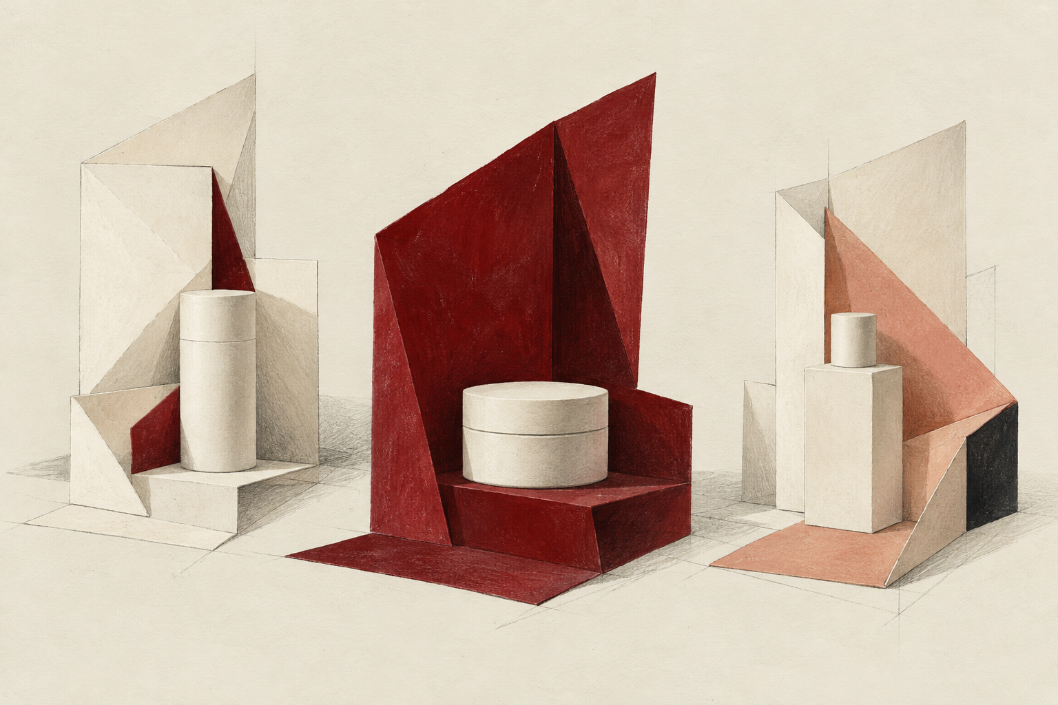
The label has a limited face on which the product name and essential information must work together. The carton offers a larger field. The digital panel may place the palette beside a photograph. These are different compositions, so the review should ask which relationships can carry across them and which need an adjustment.
In the context strip, the burgundy changes role. It is a type color on one surface, a dominant field on another and a supporting block in a digital layout. The study proposes continuity through shared roles and elements, while giving each format its own arrangement. It is an illustrative identity, not client work or an approved production design.
Color also needs companions when it carries information. W3C’s guidance for web content explains that color should not be the only visual means of distinguishing information or indicating an action. Read the guidance on using color.
For a product family, we would extend that principle into the design brief: pair a variant color with a clear product name, label or other recognizable distinction. Then review the family together, including how a person identifies an individual item. The packaging application is our design recommendation, rather than a claim that the web guideline certifies a physical pack.
One identity.
Many expressions.
The surround is
part of the story.

From a screen to an object
Moving a palette onto a physical object introduces a color-reproduction question alongside the question of context. A change in apparent color can come from the composition, the way a color is produced, the conditions in which it is viewed, or a combination of these.
The International Color Consortium explains that color management translates color data between devices, using profiles to relate device values to a shared reference. It also describes differences between the ranges of color that media can reproduce. A digital value therefore needs to be understood within a color-managed process. See the ICC’s color-management explanations.
Calibration and profiling help make display color more consistent. For a screen-to-print comparison, the ICC also discusses matching viewing conditions. These controls address reproduction and comparison; the surrounding design still needs to be considered. Read the ICC’s display-calibration guidance.
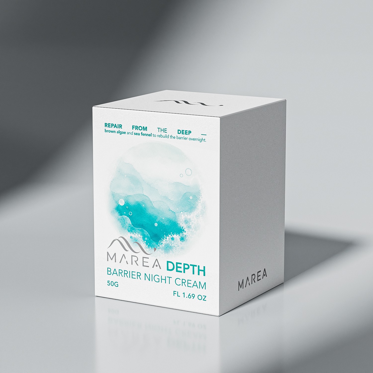
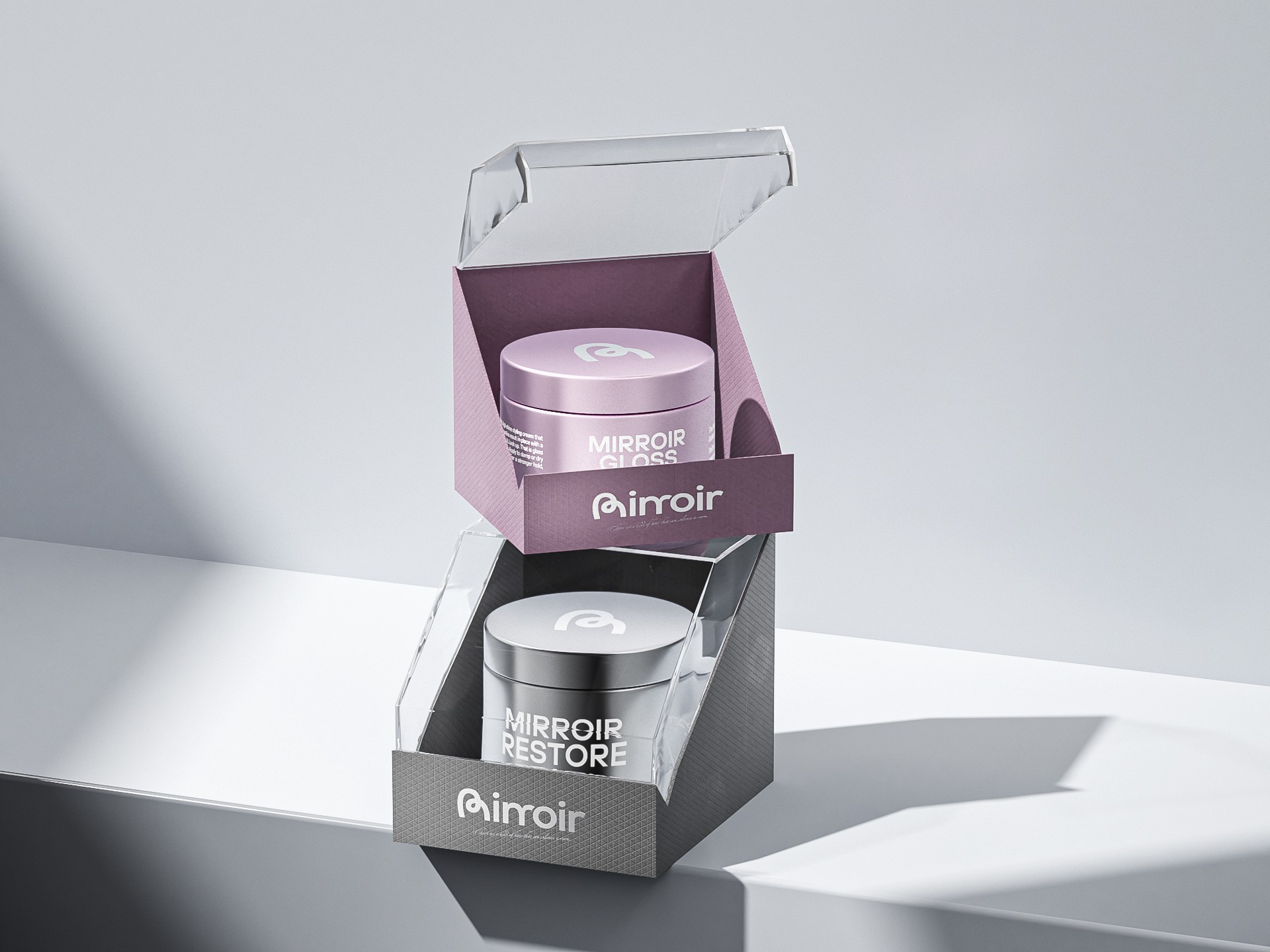
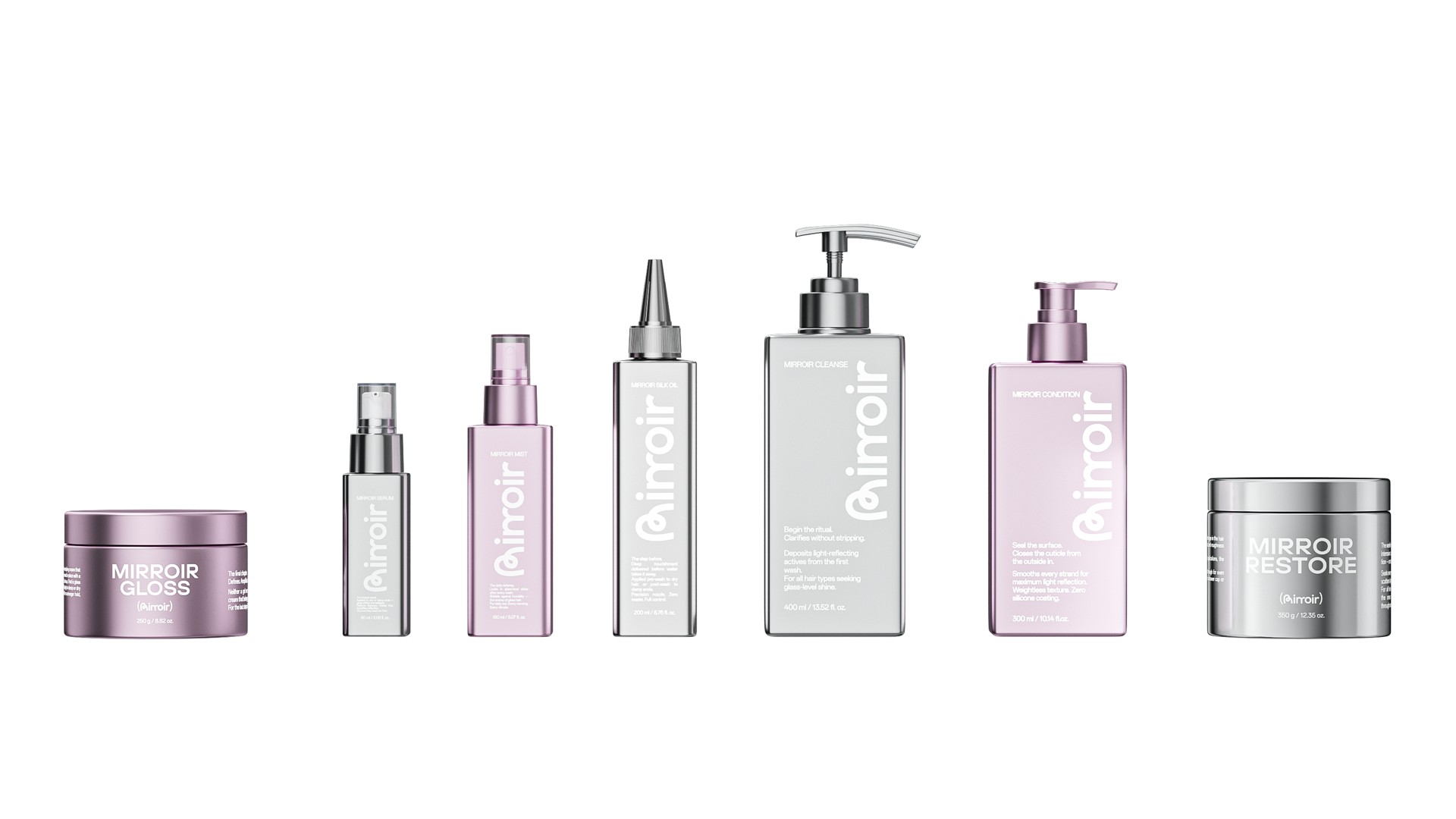
For a brand team, the practical response is to review both the composition and representative physical samples. If the brief includes a paper label, a printed carton and a decorated container, ask to see the proposed color on those intended surfaces. Keep an isolated reference available, then examine it as part of the assembled design.
Use the review to identify the question before deciding on a correction. Does the isolated sample already differ from the agreed reference? Does it appear different only after it is placed beside another color? Does a change of lighting alter the comparison? Each observation points to a different discussion with the designer and production team.
A screen study helps make the questions visible early. The physical review should establish the relevant references, materials and viewing conditions with the people responsible for producing the object. It also gives the team a place to record which relationships need to survive the transition.
Which question first?
Does it appear different only after it is placed beside another color?

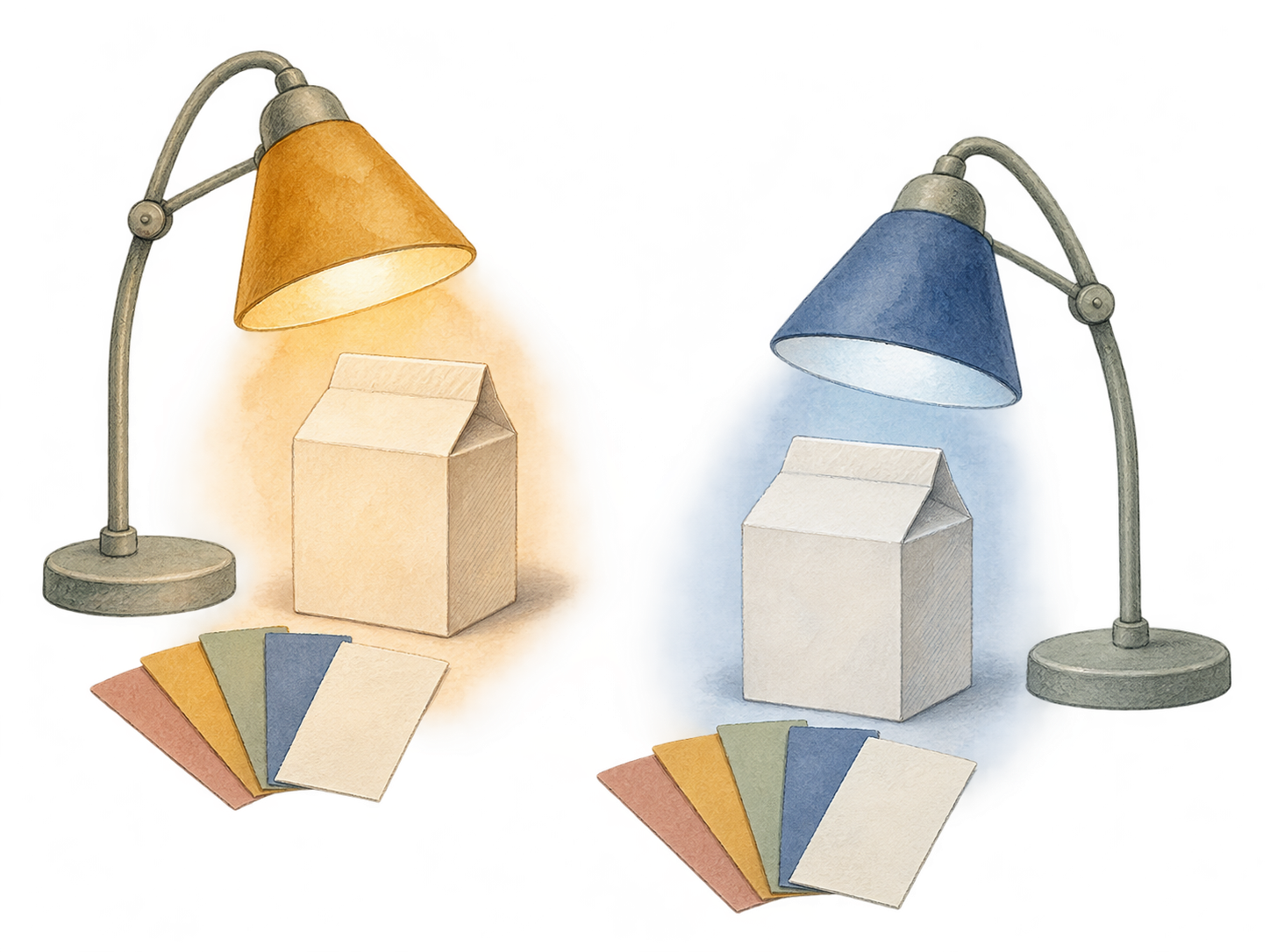
| Question | Useful comparison |
|---|---|
| Visual context | Keep one color fixed and change its surround. Compare the resulting appearance. |
| Color reproduction | Compare representative output against the agreed reference, with the production process and material identified. |
| Viewing conditions | Record the lighting and display conditions used for a comparison, and examine what changes when those conditions change. |
Make the handoff precise
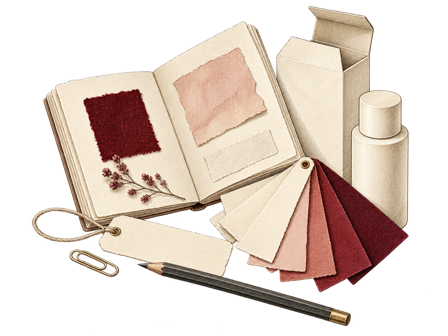
A useful color handoff records both the intended appearance and how the team will judge it. A bottle, label and carton may share a palette while requiring different production discussions. We propose treating the palette as a short decision record, with one entry for each intended surface and use.
The International Color Consortium explains that profiles relate device values to a standard color space, while reproduction media can have different color gamuts. For a brand team, this supports a practical distinction: a digital reference, a production process and a physical comparison each have a role. The five fields below are our proposed handoff structure.
A record for every surface.
| Record | What travels with the design | The question it answers |
|---|---|---|
Reference | The agreed physical or digital reference, identified by version. | Which target are we comparing against? |
Material and finish | The actual substrate and intended surface treatment for each component. | What will carry the color? |
Output process | The relevant print/decorating process and color-management setup. | How will the color be produced? |
Viewing conditions | The agreed lighting and comparison conditions. | Under what conditions is it judged? |
Artwork context | The surrounding colors, type, imagery and adjacent components. | Which relationships must remain consistent? |
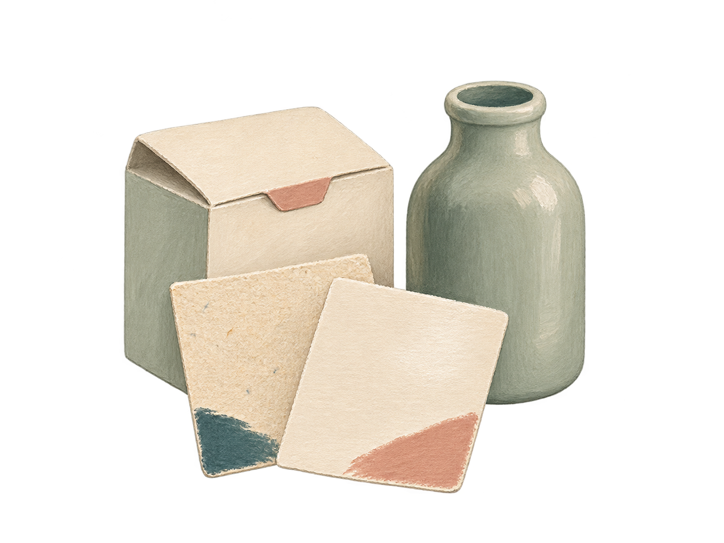


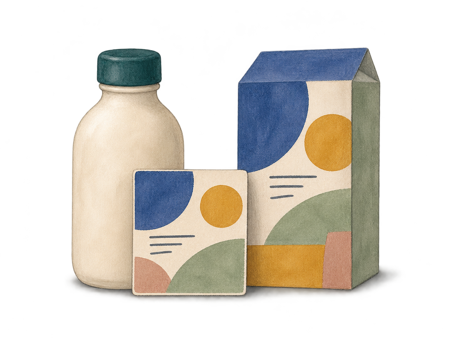
Keep photographs and renders as visual explanations, and evaluate representative physical samples for production approval. Agree the measurement method and acceptance criteria with the people responsible for producing the object. Attach each design decision to the conditions under which it was made.
Try a context review
A small context review turns palette approval into a set of comparisons. Bring together a digital layout, a physical color reference and representative label or carton studies. The following sequence is a proposed design exercise; it is not a production test or a substitute for an agreed color specification.
- Hold one thing constant. Choose one color or element to follow through the review. Note what changes around it. If everything changes at once, the comparison becomes harder to explain.
- Change the surround. Place the chosen color beside a light field, a dark field and a relevant image. Compare the compositions before changing the color itself.
- Change the proportion. Try the palette as a small label, a larger panel and a compact digital composition. Describe which color leads and which one supports the information.
- Bring the family together. Set variants side by side. Check shared identity elements and the words that distinguish each item, as well as the color differences.
- Record the conditions. Keep a note of the material, artwork version, physical reference and viewing situation. Separate observations about appearance from decisions about production matching.
End with specific decisions: which color takes the largest area, where the product name sits, what identifies a variant and which physical samples need another review. A short record of those decisions makes the next comparison more useful.
Review in five moves
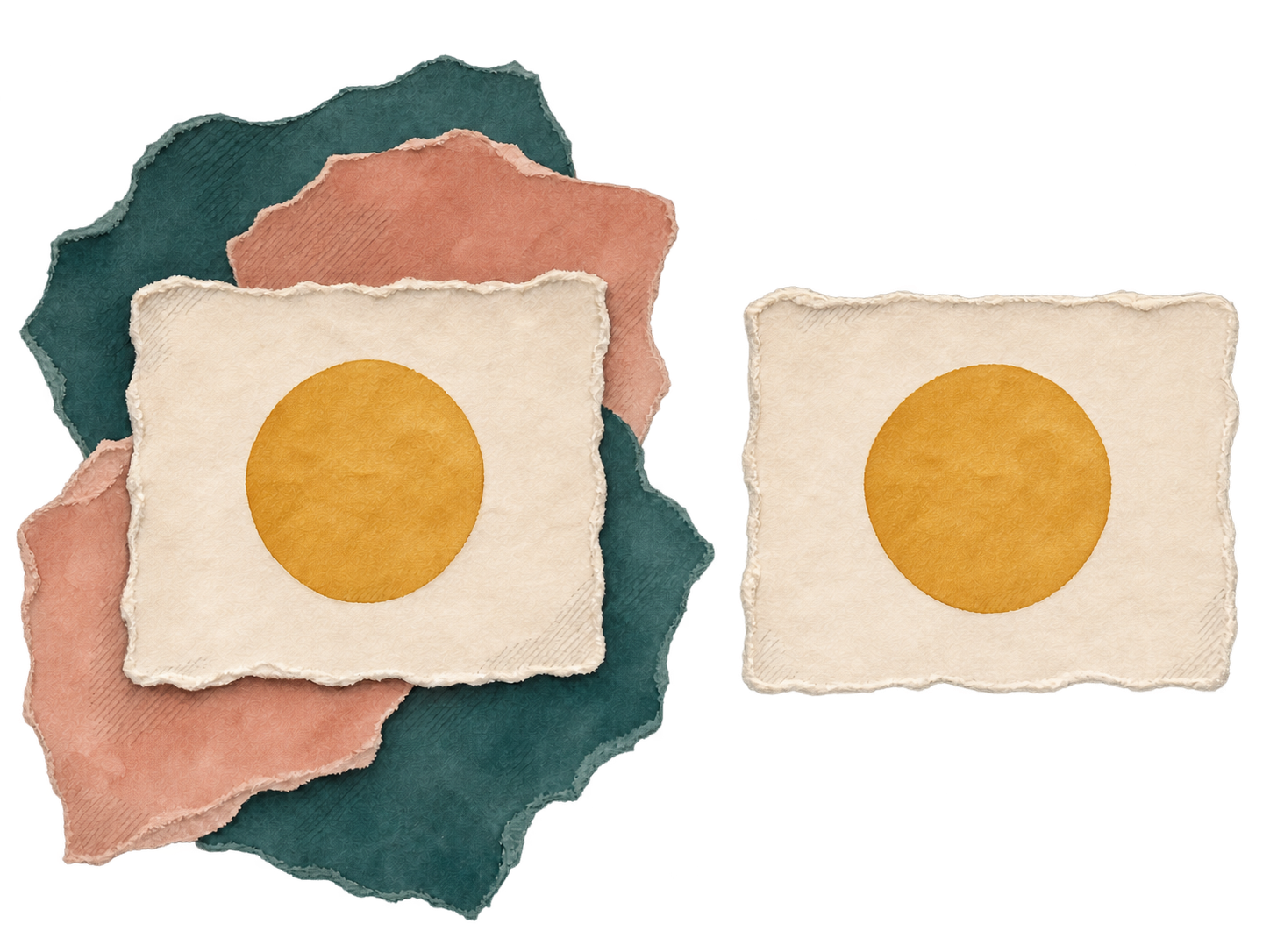
Follow the ochre circle. Its digital color stays #D6AB52.

Studio perspective
A reference names a color.
A composition gives it a role.
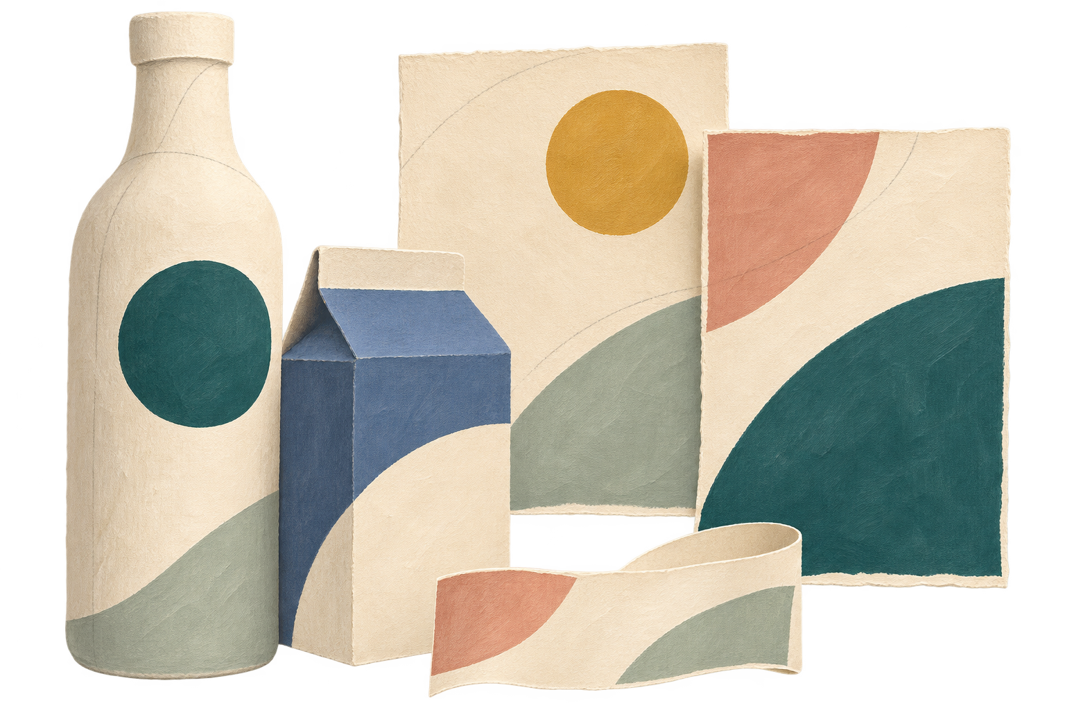
At Jarsking Studio, our view is that a palette becomes a stronger design tool when its references are accompanied by examples of use. A reference tells the team which color is intended. The examples show the relationships the identity needs: ground and type, image and frame, individual object and product family.
This leaves room for a palette to behave differently across formats while remaining part of one identity. It also makes the brief more precise. Instead of asking only whether a color is right, we can ask whether it has the right role, whether the information remains clear and whether the physical result supports the design intention.
The value of the Albers connection is that it brings attention back to looking. Before adding another color, change the surround. Before rejecting a palette, change the proportion. Then take the relationships that seem promising into the context where the design will actually be encountered.
Questions about color
Why does one color look different?
A color’s appearance can be influenced by its surroundings. Placing the same digital color inside different fields lets you compare that relationship while holding the center value fixed. The impression may vary with the viewer and display. A physical color comparison introduces additional questions about materials, reproduction and lighting.
Can a swatch define a brand palette?
A swatch provides a reference, but a useful palette also needs examples of use. Show which colors act as grounds, type colors, dominant fields and accents. Review those roles with relevant typography and imagery, then compare representative formats such as a digital layout, label and carton.
Will a screen match a printed package?
An on-screen color does not establish an automatic match to a printed package. Color management, the output process, material and viewing conditions all need consideration. Use the screen to develop and compare the design, then review representative physical samples against the agreed references with the production team.
How can a range stay coherent?
Give the range a shared visual structure, then define how individual products differ within it. Review colors together with names, type, layout and other identity elements. A practical study can vary color proportions across formats while keeping selected elements consistent. Assess the resulting family as a whole and each item individually.
Working on a brand palette or packaging identity? Explore Jarsking Studio’s design services or start a project conversation.
Sources & further looking

Research links checked 29 October 2026.