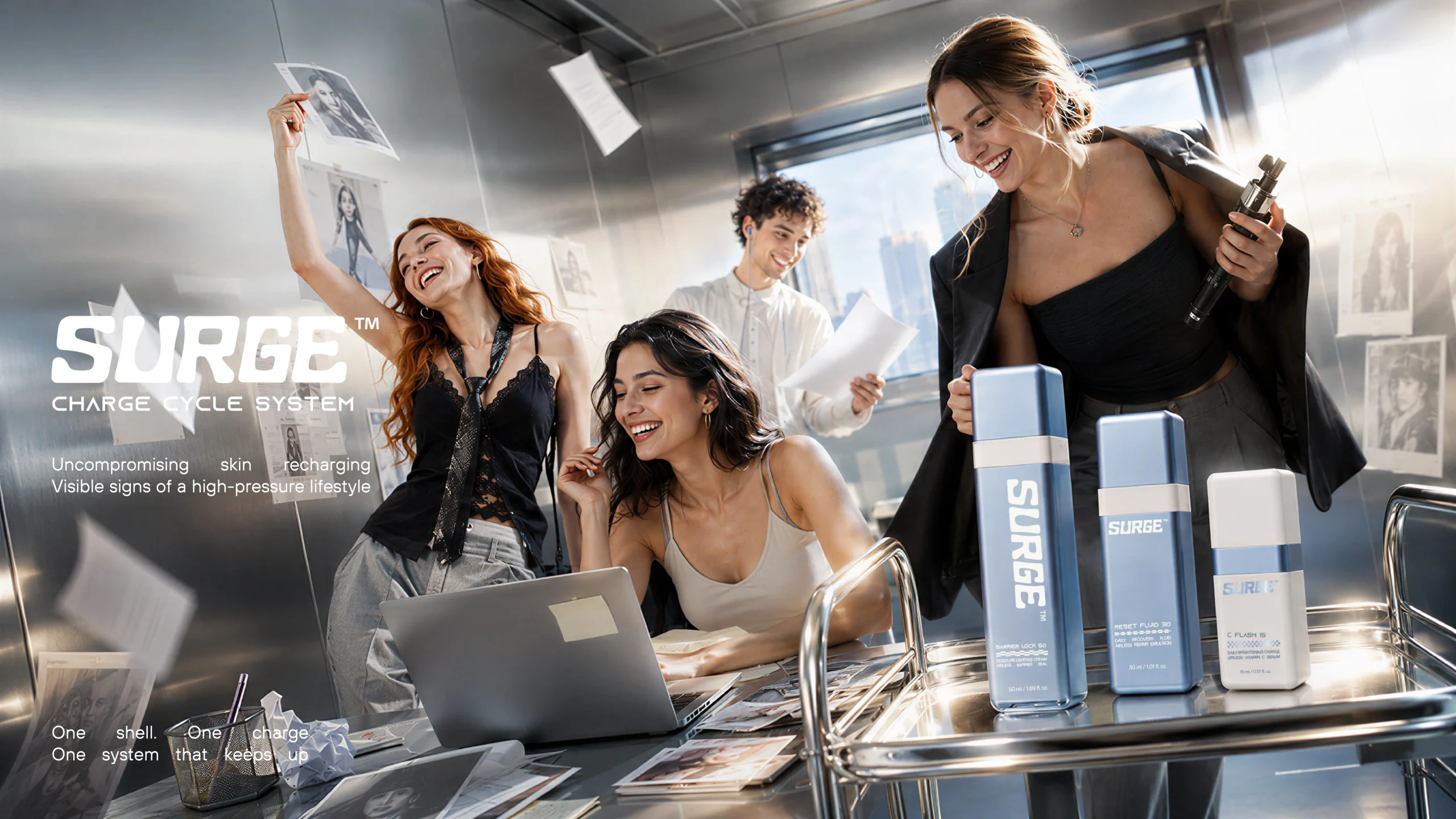
SURGE™: Designed to stay. Made to go places.
SURGE™ turns refillable skincare packaging into a story of daily rituals, personal objects and a visual identity that moves with you. A Jarsking Studio concept.
Design something worth keeping.
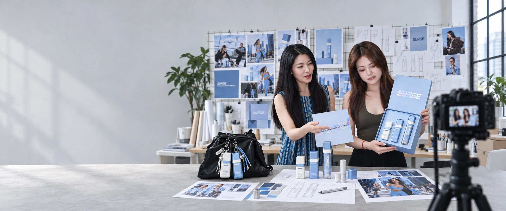
SURGE™ is an in-house refillable skincare packaging and brand identity concept by Jarsking Studio. Starting with a square airless bottle family, the project connects graphic design, refill packaging, carry accessories and campaign imagery around one proposition: the object that stays should be worth keeping.
- Project
- SURGE™ — Charge Cycle System
- Studio
- Jarsking Studio
- Project type
- In-house design concept
The outer bottle remains.
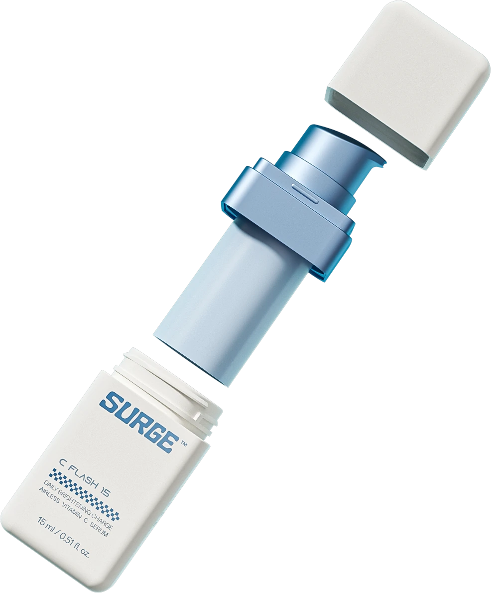
A refillable package changes the relationship between a product and its container. The contents are used up. The outer bottle remains.
That remaining object carries a different design responsibility. Its appearance has to make sense beyond the first purchase, through repeated handling, new refills and changing surroundings.
This became the starting point for SURGE.
The brief: give the retained bottle a lasting identity
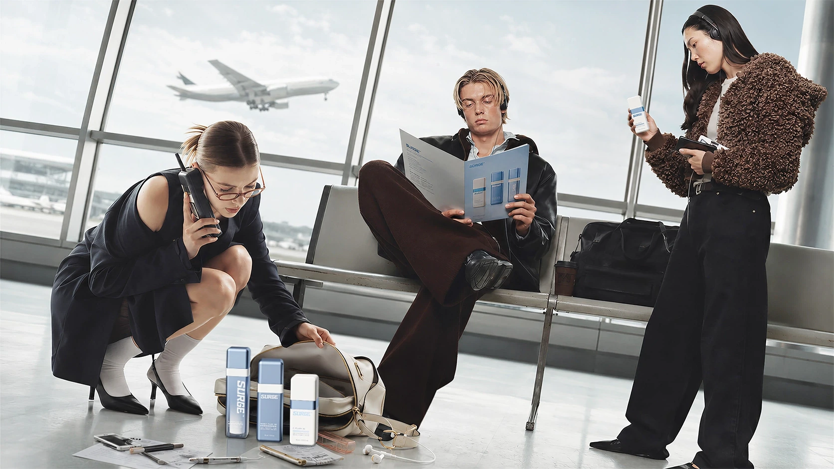
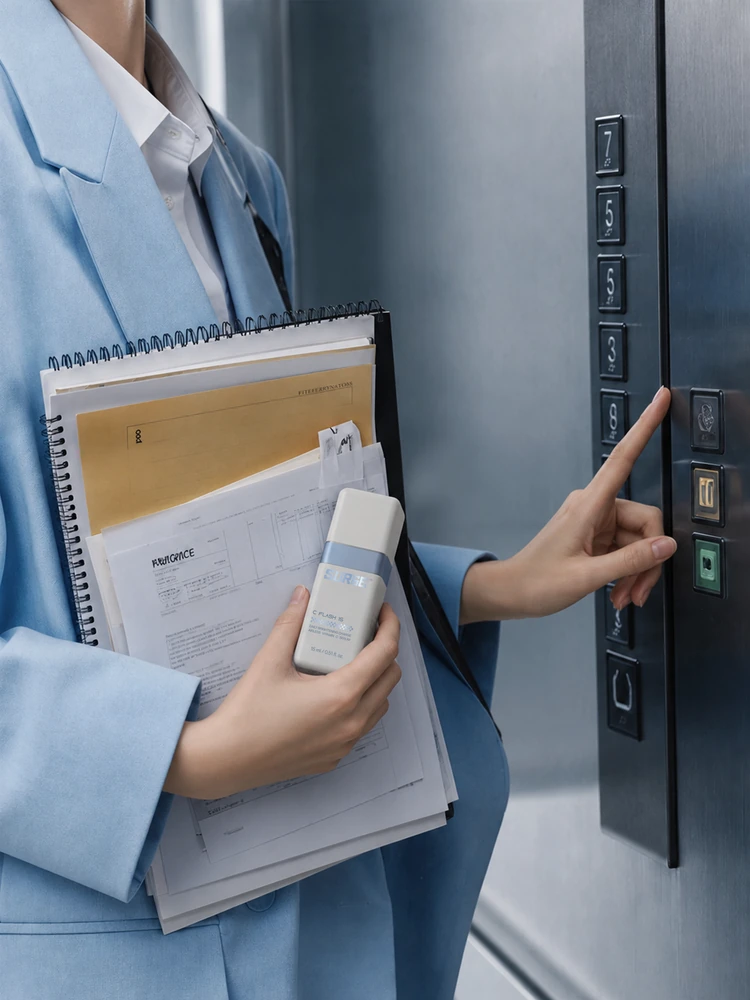
We approached the bottle as a piece of personal equipment: compact, purposeful and recognisable among the things someone uses every day. The brief followed a life spread across desks, commutes, training sessions and departures. Skincare needed a place within that movement.
The creative task was to give the refillable structure a character that could travel with its owner.


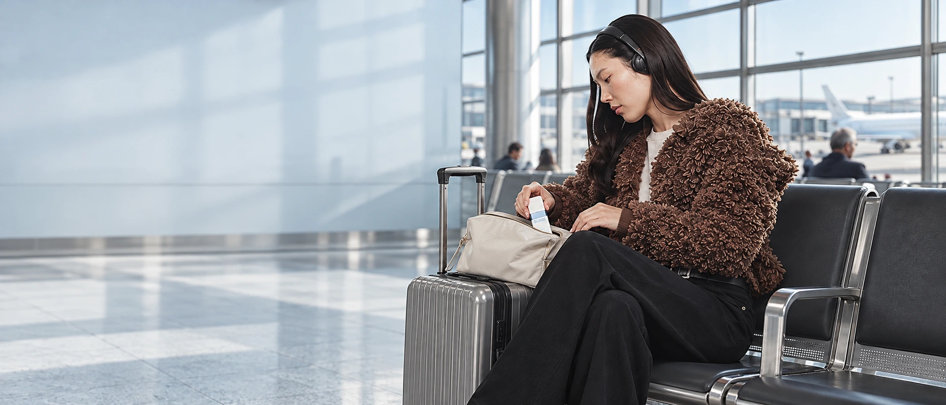
The inspiration: equipment, movement and everyday interfaces
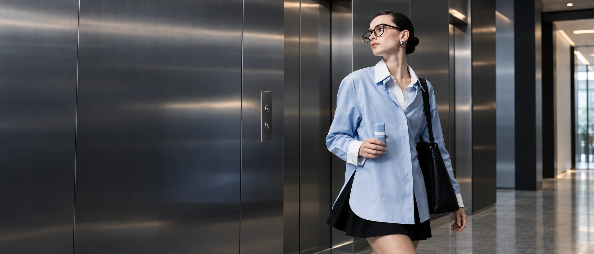
SURGE draws from sports technology, transit graphics and the hardware of functional clothing.
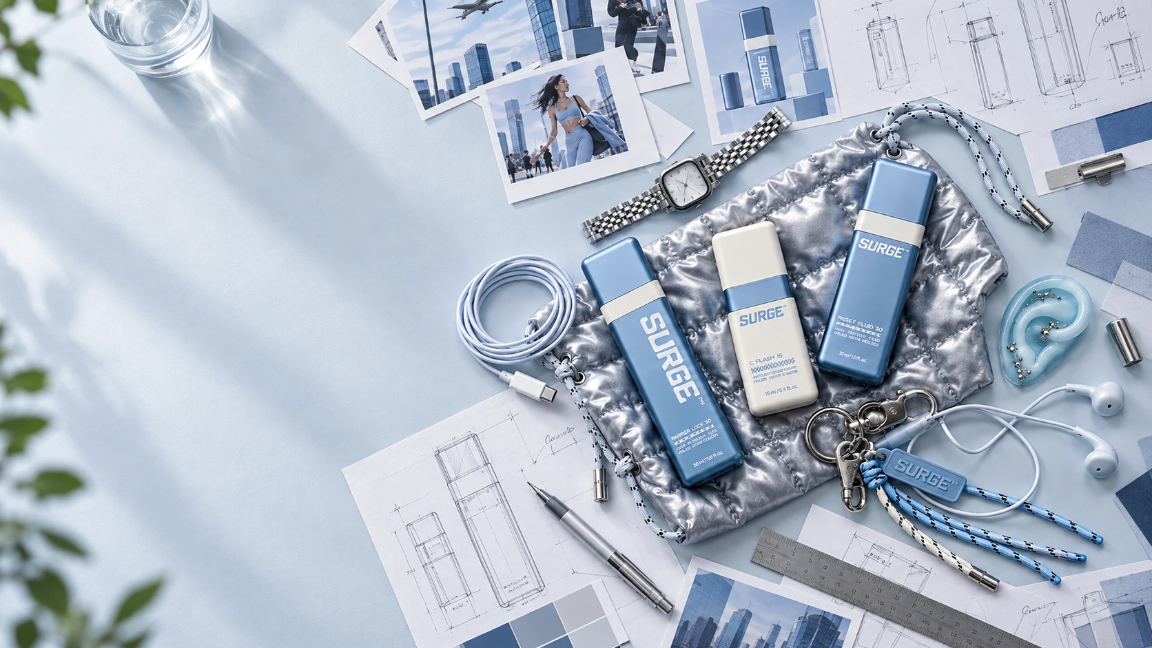
These references offered specific design tools. Sports equipment suggested compact forms and decisive colour blocking. Transit systems informed the hierarchy of lettering, numbers and repeated symbols. Wearable hardware introduced cords, loops and attachments that could extend the bottle into everyday carry.
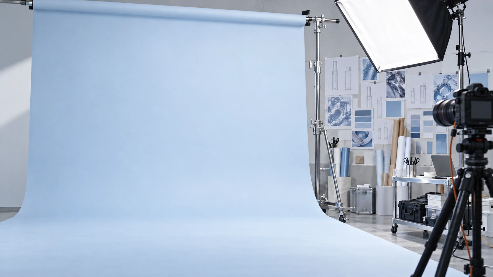
Together, they established a vocabulary for the project: clear geometry, compressed information and visible energy.
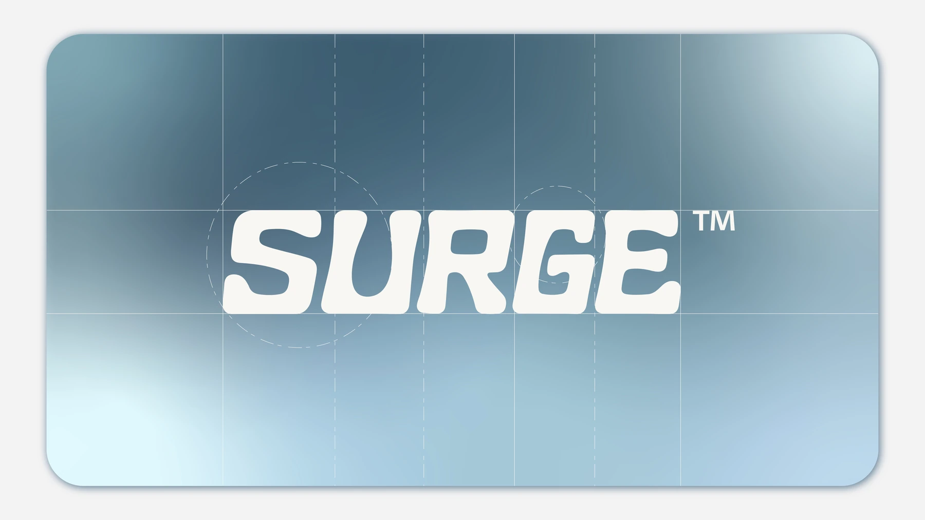
That energy needed discipline. The bottle’s square outline provided an organising structure; the graphic identity could then introduce direction and pace across its surfaces.
The result is a skincare concept with the visual directness of equipment someone already knows how to bring into their day.
Building the identity on a square bottle
The bottle’s broad faces became the foundation of SURGE’s graphic system.
They provide room for an oversized wordmark, a clear product code and a controlled arrangement of smaller information. The softened corners give the graphics a continuous surface to wrap around, connecting the front of the pack with its sides.
The forward-leaning SURGE lettering introduces movement within this stable geometry. Its weight makes the name prominent, while its rounded forms relate to the bottle’s eased edges.
Checker patterns add a second rhythm. Changes in density create variation within a tightly controlled grid, giving the identity a graphic element that can expand across packaging, printed material and campaign backgrounds.
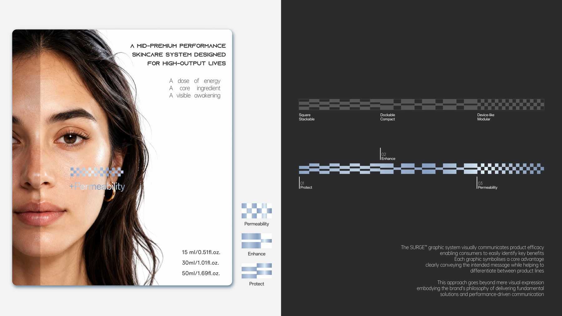
A narrow contrasting band marks a consistent horizontal line around the pack. Alongside the wordmark and square silhouette, it becomes another recurring cue across the family.
These elements work together at different distances: the silhouette establishes the object, the wordmark identifies it, and the smaller graphic details reward a closer look.
Blue, white and silver create a shared visual language
Blue
The developed artwork brings SURGE together through blue, white and silver.
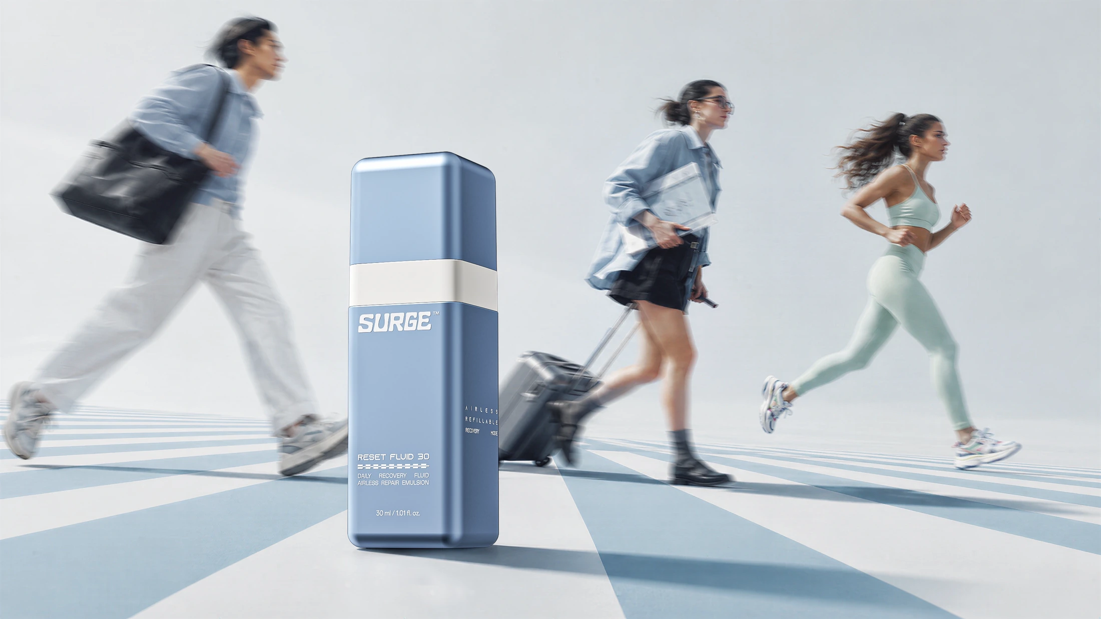
Blue occupies large areas of the bottle and its surrounding imagery, giving the project a colour that can extend well beyond the label.
White
White creates sharp separation for the lettering, product codes and contrasting bands.
Silver
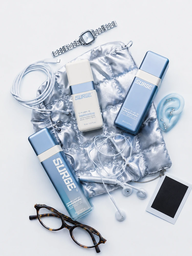
Silver introduces reflections and a connection to the technical accessories within the concept.
Light
The palette also allows the identity to change through light.
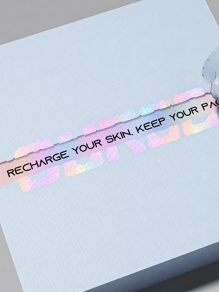
Frosted surfaces soften the colour. Gloss accents sharpen individual details. Reflective elements on the secondary packaging introduce another register of the same identity.
Together
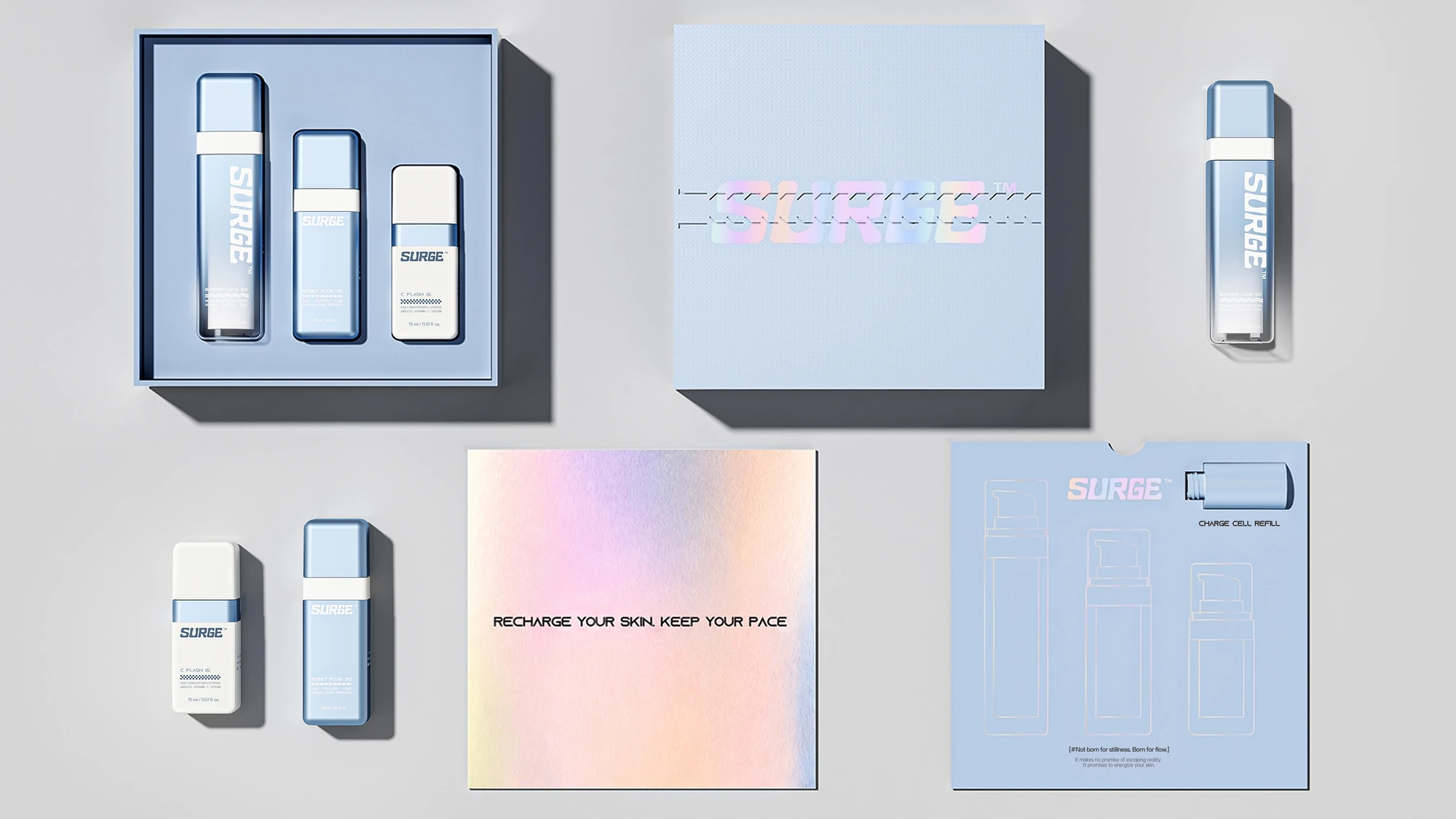
This gives SURGE variation through surface and proportion while keeping the family visually connected.
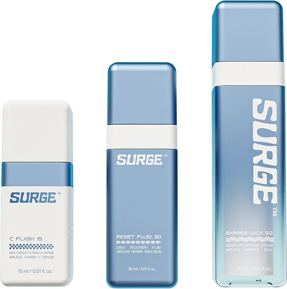
Three sizes, three roles within the routine
The proposed product family explores how one identity can accommodate different scales of use.
| Concept product | Capacity | Role within the design concept |
|---|---|---|
| C FLASH 15 | 15 ml | The compact carry format, introducing the system at its smallest scale |
| RESET FLUID 30 | 30 ml | The central everyday format within the family |
| BARRIER LOCK 50 | 50 ml | The larger format, extending the same identity into a more substantial presence |
The names and numerals give each product a distinct place in the range. A consistent front-face hierarchy connects them, while changes in proportion and colour balance create individual character.
This is important to the way the concept is photographed and presented. One bottle can carry the identity on its own; the three together reveal the organisation of the complete range.
Carry accessories introduce a personal relationship
Attach
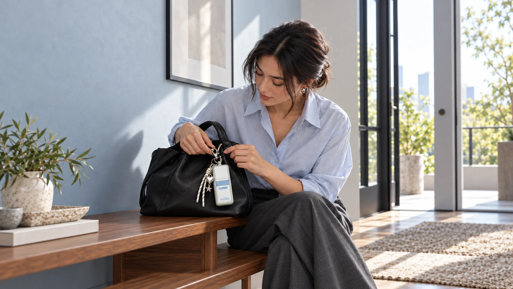
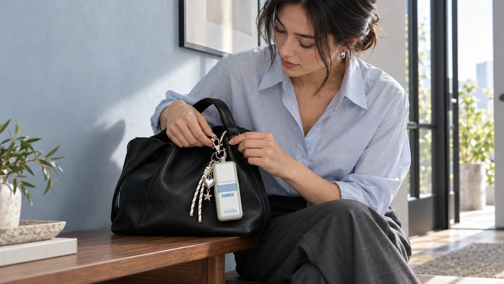
The accessory concepts explore what happens when the bottle becomes something a person chooses to carry visibly.
Personalise
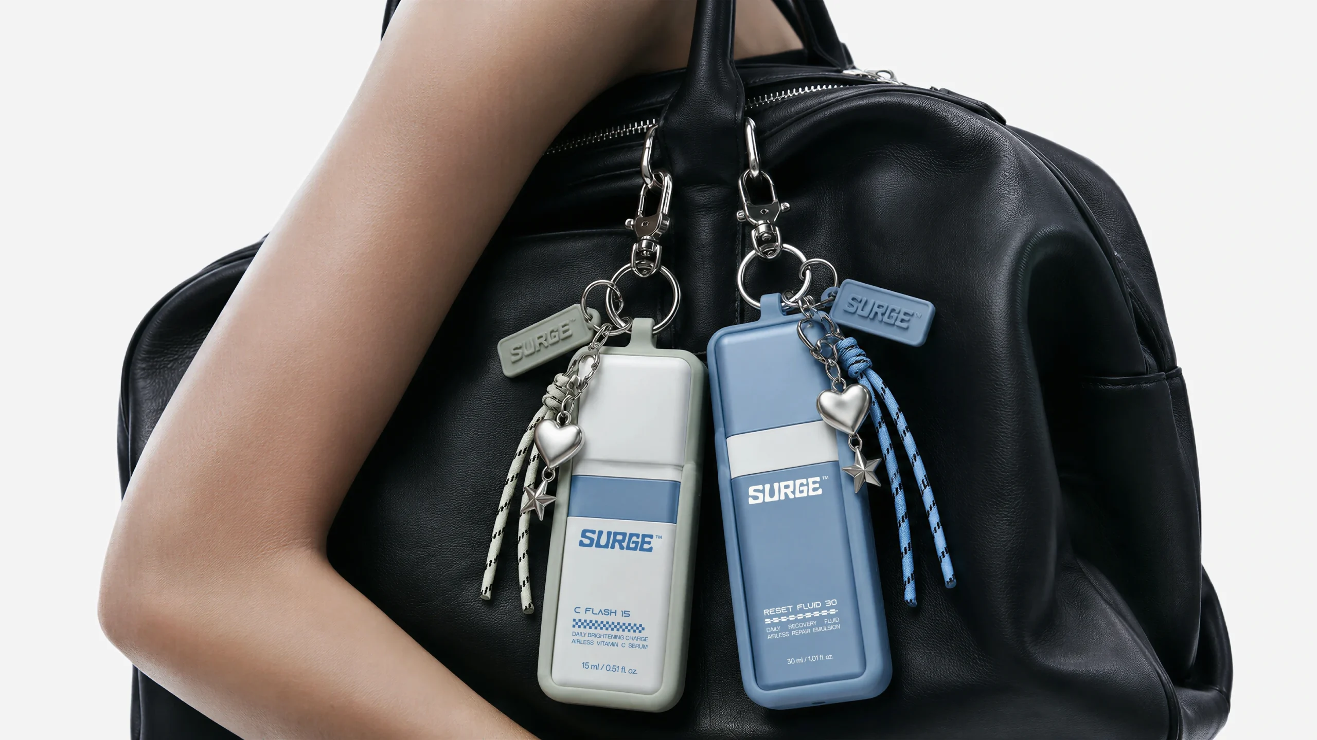
Soft silicone sleeves meet the geometry of the pack. Braided cords, graphic tags and attachment loops connect it with bags and other belongings. Small charms introduce individual choices into the otherwise controlled identity.
These details change the character of the object.
In the bag
The square form and technical graphics establish precision. A cord, a soft case or a chosen charm brings a more personal quality to that precision. The identity becomes open to small acts of ownership.
Everyday
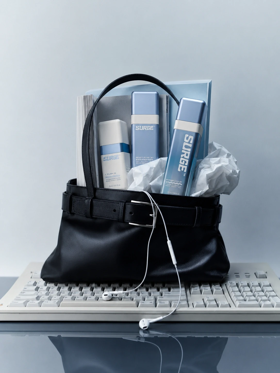
In the everyday-carry compositions, SURGE appears alongside watches, earphones, glasses and pouches. These familiar objects give the packaging a context beyond its product category: a collection of things selected, handled and taken along.
For a refillable concept, that relationship matters. The part intended to remain in use also becomes the part someone can make their own.
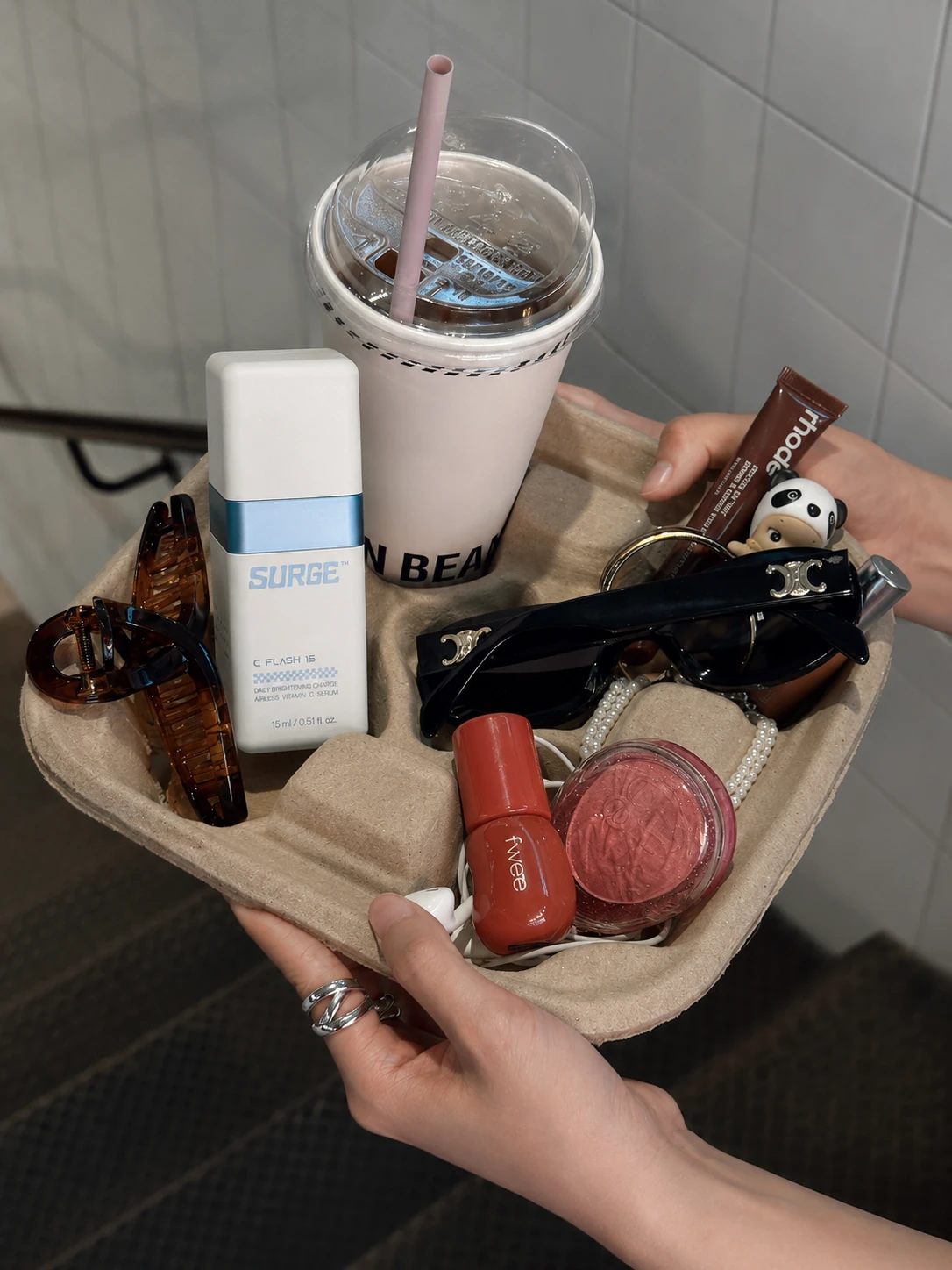
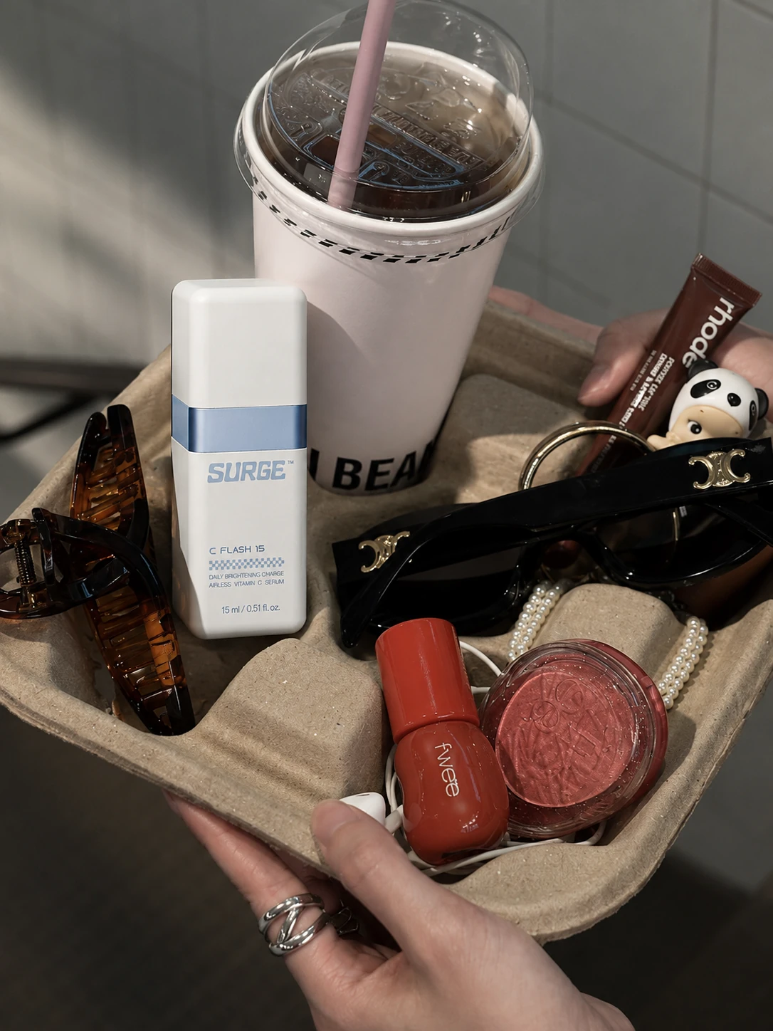
Campaign art direction: testing the identity at different scales
Hand
The campaign concepts move SURGE through three scales: the hand, the moving crowd and the street.
At close range, the focus is on handling, surface and the relationship between the bottle and its accessories. The object is small enough to belong among personal possessions.
Crowd
In the urban compositions, oversized bottles meet blurred pedestrians and transit settings. Changing the scale makes the packaging’s geometry more pronounced. The wordmark, colour blocks and horizontal bands become the elements that hold the image together.
Pop-up truck
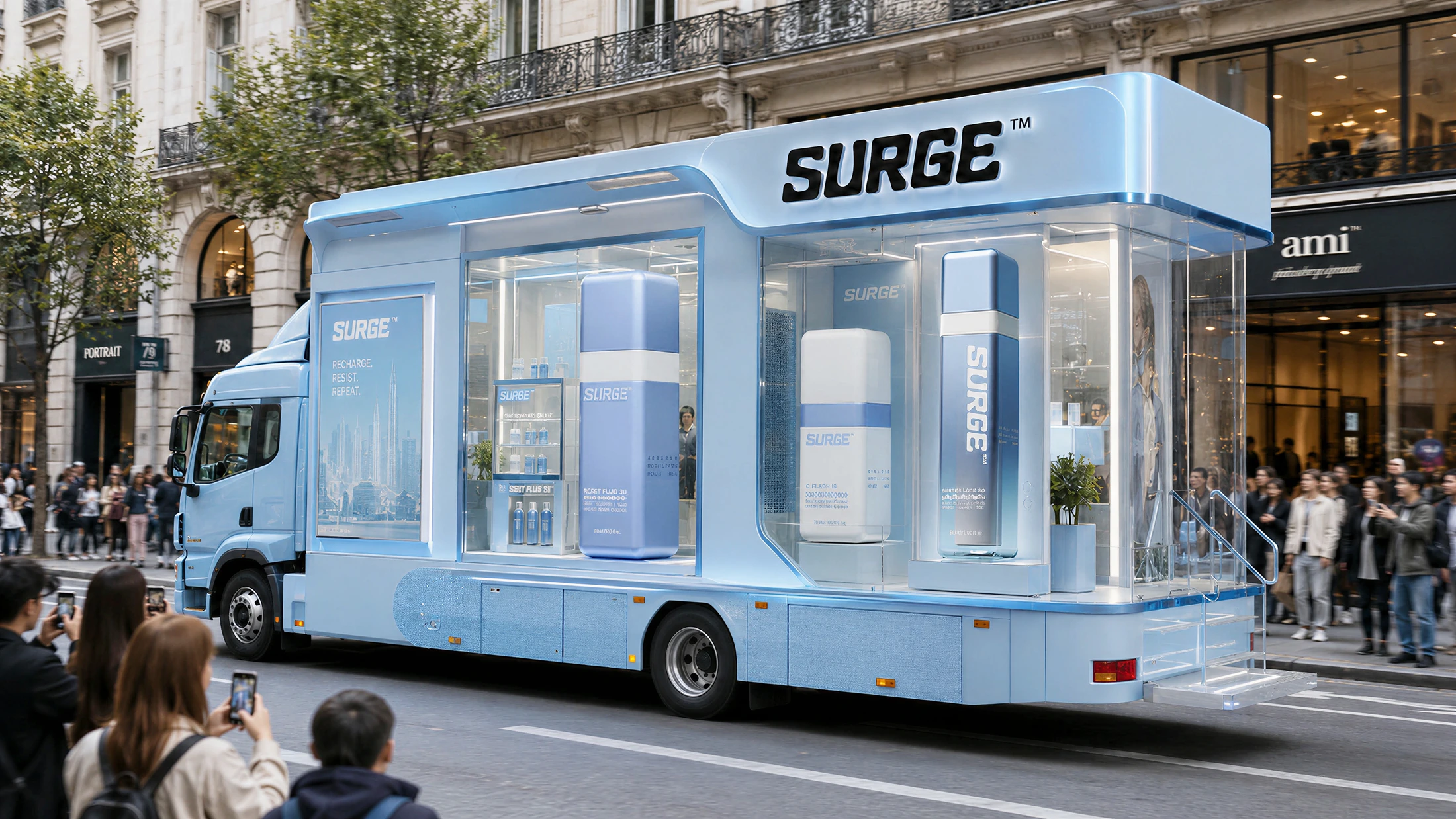
The campaign imagines a SURGE pop-up store on a moving truck. Transparent walls, oversized bottles and blue architectural surfaces turn the vehicle into a travelling brand experience, bringing the skincare concept into the city.
Digital campaign
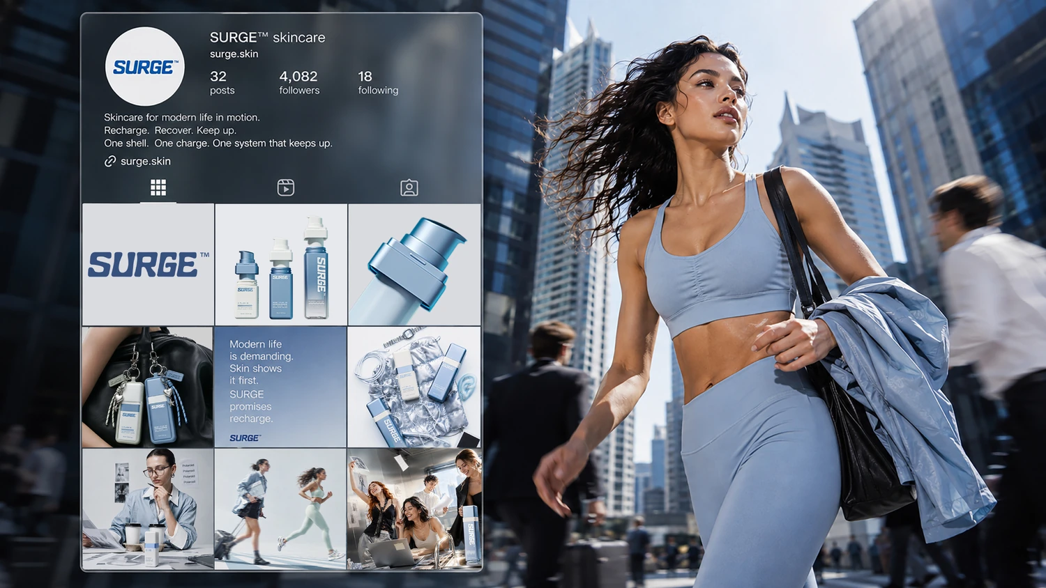
The digital marketing campaign brings SURGE into the scroll. Product portraits, city scenes and graphic compositions carry the identity across social feeds and online campaign imagery.
The bottle’s square silhouette, blue palette and contrasting bands become a visual thread, connecting each image as the story moves from product detail to daily life.
Project questions
What is the SURGE™ Charge Cycle System?
SURGE™ — Charge Cycle System is an in-house design concept by Jarsking Studio. It explores a refillable skincare identity across airless bottles, replacement-cartridge packaging, carry accessories and campaign imagery.
What inspired SURGE’s packaging design?
The concept draws from sports technology, transit graphics, functional clothing hardware and portable devices. These references inform its square geometry, prominent product codes, forward-leaning lettering and accessory system.
Why is refill central to the SURGE concept?
Refill creates continuity between uses: the outer bottle remains while the inner cartridge is replaced. SURGE develops that relationship through Charge Cell naming, refill packaging and a visual identity carried by the retained object.
Is this a launched skincare brand?
This page presents SURGE as a Jarsking Studio design concept. The product names, accessories and campaign applications form part of that creative exploration.
Develop your next packaging identity with Jarsking Studio
Bring us a product idea, an existing packaging format or a brand ready for a new direction.
We develop the concept, visual identity and packaging expression together, giving the product a clear story across the object, its presentation and its imagery.
Discuss a project with Jarsking Studio
SURGE™ / A Jarsking Studio concept